If you've been on this earth after 1928, then Disney has probably been a part of your life for as long as you can remember. More than likely, you have an answer for what your favorite Disney movie is, who's your favorite character, and why. Say what you want about them as a company, but Disney is normally visual comfort food
We all have our favorite reasons for loving our favorite characters, but some of these characters have come a long way. Many Disney favorites are the complete opposite of what was intended for their respected movies. To find out what we mean, have a look at some of Disney's earlier character work.
10 Simple Sorcerer Mickey
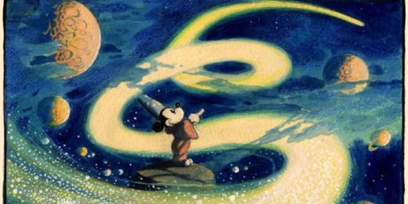
This isn't a big change as far as personality goes, Mickey Mouse doesn't exactly need much help there, but it was a big deal for Disney's art department in 1940. For his feature-film debut as the Sorcerers Apprentice, Disney and his team decided Mickey needed a makeover.
Disney artist Fred Moore essentially reworked Ub Iwerks's original design into the modern Mickey we can see everywhere now. Moore gave Mickey a more pear-shaped body, a more detailed face, and removed the iconic pie-eyes for better emotion. It might seem minor now, but if it wasn't for the redesign, we wouldn't have the mouse we know today.
9 Hellbound Hades
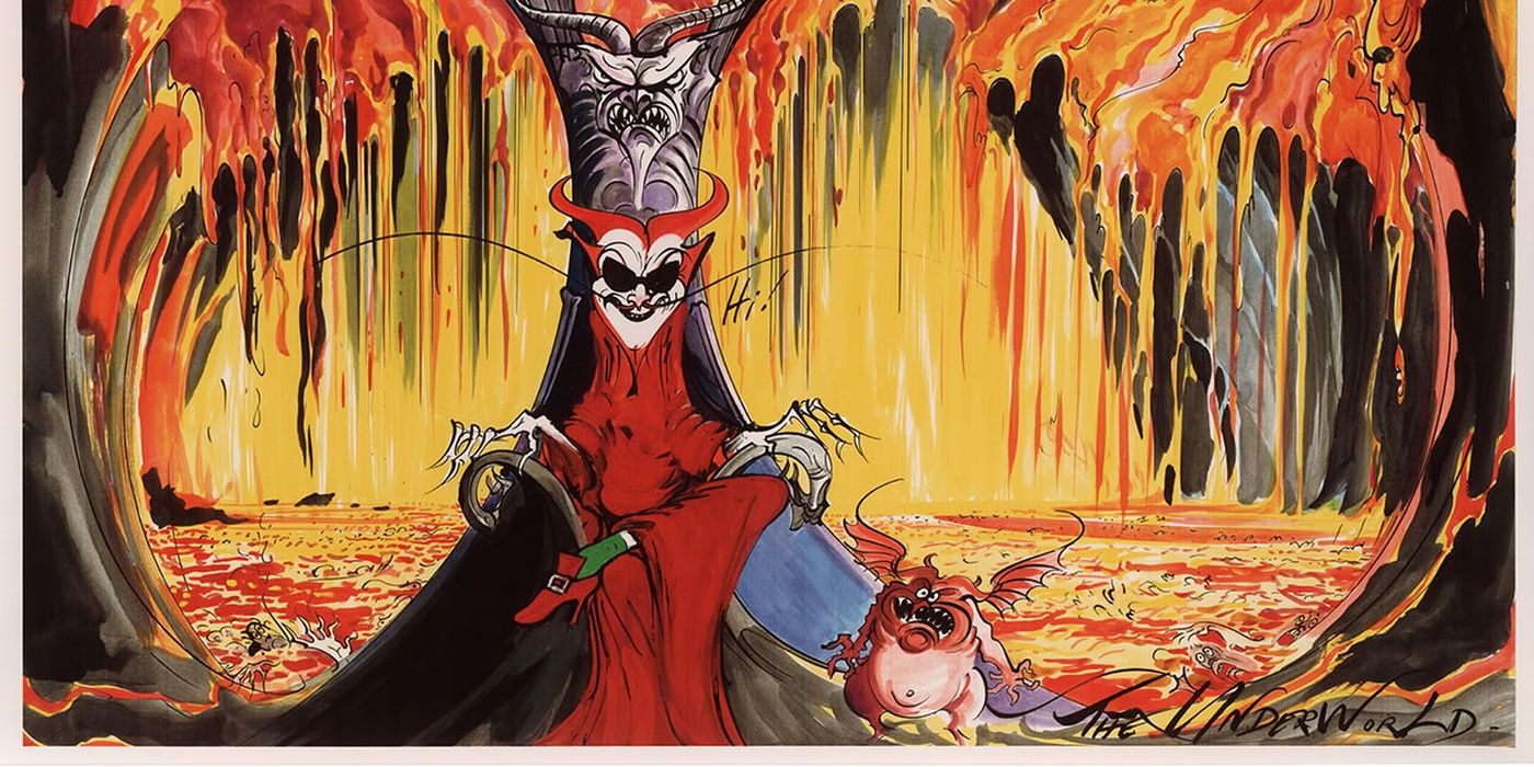
James Woods made himself a Disney icon when he assumed the role of Hades in Disney's Hercules, but true Disney buffs know he wasn't the studio's first choice. Originally, Jack Nicholson was to have been the lord of the dead, but with a far more devilish design and sinister overtones.
The original designs and concept for Hades and the underworld had a more demonic and hellish motif going on. Aside from giving Hades some Jack Nicholson shades, he was more of an exaggerated devil than anything else. With a fiery red color-scheme, pointed features, and hair that looked like horns, he was a far cry away from the smooth-talking guy we know and love.
8 Evil Elsa
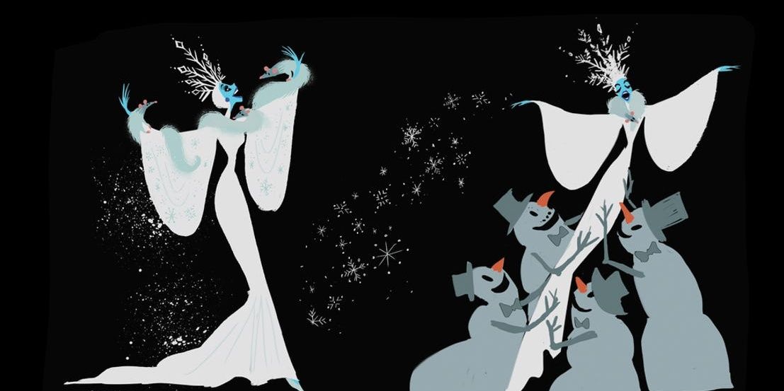
Anyone familiar with the original Snow Queen by Hans Christian Andersen knows that the book version of Elsa was not the Disney royalty we see in the film. Surprisingly, the studio wanted to go that route in the original drafts. This means Elsa was originally the film's villain.
Elsa's original story had her being sort of a hybrid between the Evil Queen and Cruella De Vil with an army of giant killer snowmen and a living coat of minks. Though the final version's tale of sisterly love ended up being Disney's cash cow, we would have much rather seen this twisted version.
7 Curvacious Cruella
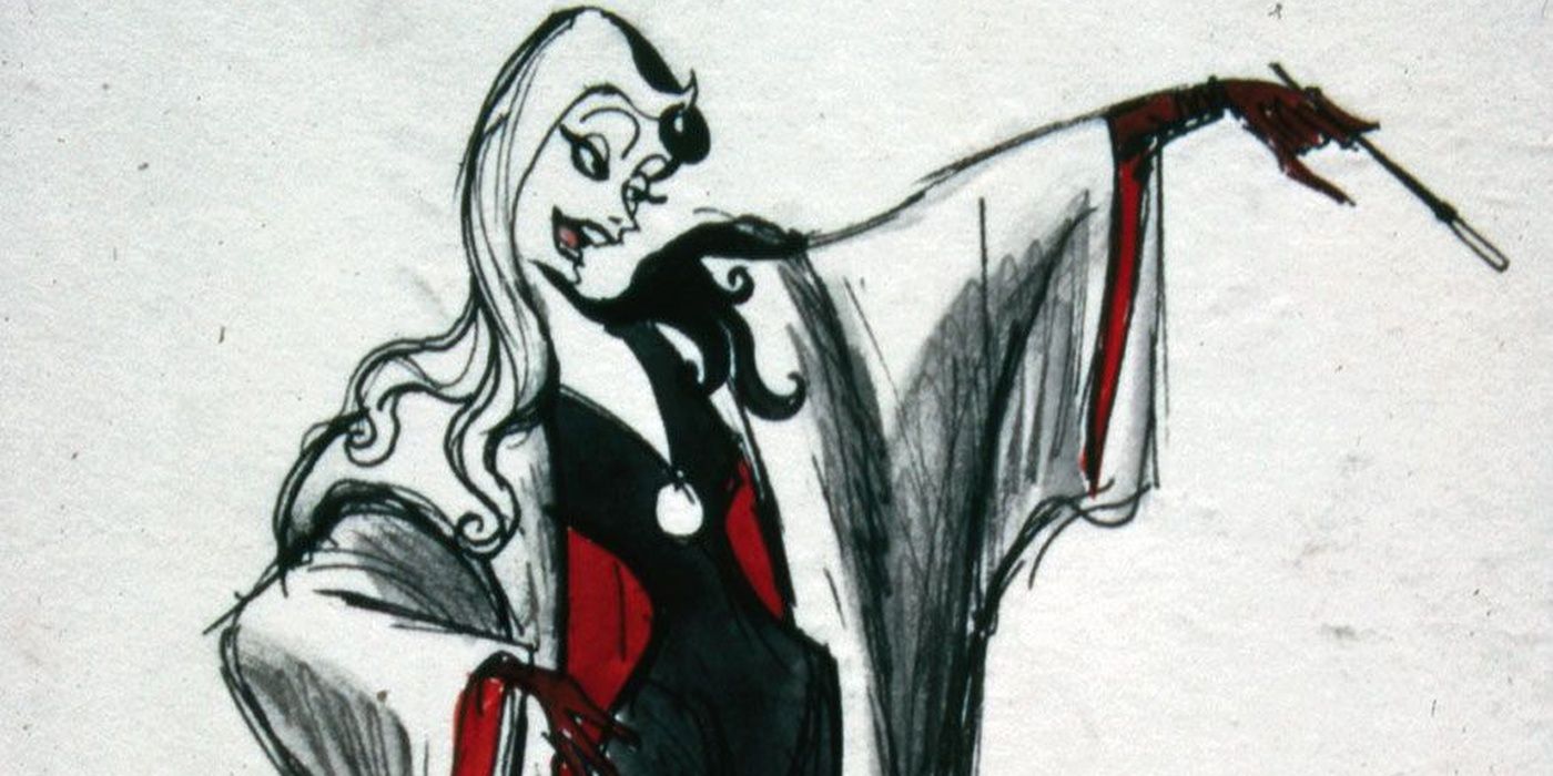
Yet another design choice that makes our list, it's a much more book-accurate version of Cruella De Vil from Disney's 101 Dalmatians. Instead of being the slinky, skeletal form consumed by that monstrous fur coat, Cruella was originally a younger and more attractive figure, similar to a Bond or '60s Batman villain than the maniac we ended up with.
In the original sketches by Marc Davis, Cruella was designed to look closer to Anita's age as she's described in the original book by Dodi Smith. Since she shares a designer with Maleficent, you'd think a fiery femme fatale woud be no problem, right? Well, Disney liked the current design better. Sorry, Mr. Davis...
6 Stitch the Space Gangster
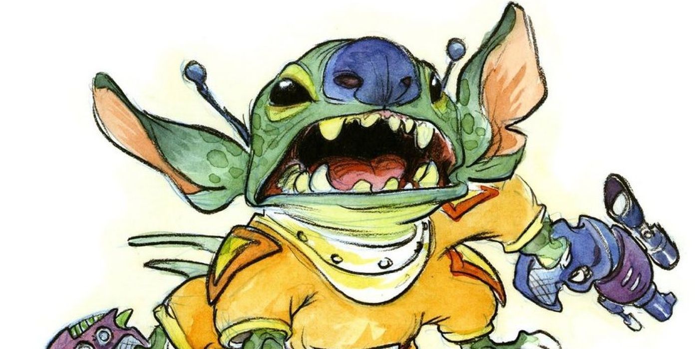
To put it plainly, a lot of things were changed during the development of Lilo and Stitch. In fact, there's very little in common with the original pitch by Chris Sanders and the movie that got released, except for a little girl adopting an alien as her pet and protector.
Originally, Stitch was more of a brute than cute and fluffy. The original storyline had him as a space-gangster on the run from galactic authorities and a vengeful accomplice. Thankfully, we got more of a weird and wonderful sci-fi adventure in the end, and we couldn't be happier.
5 Robot Raccoon
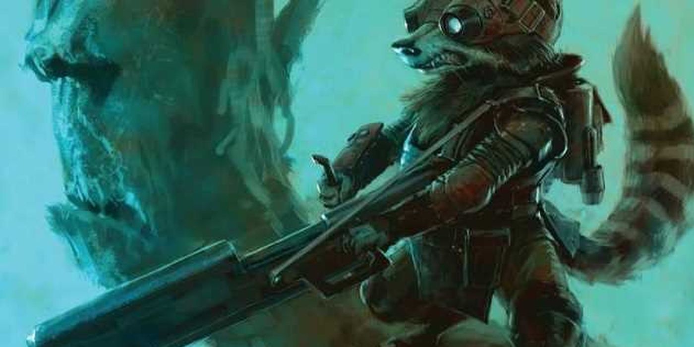
We're including this Marvel mainstay on our list simply due to two reasons. One, it's completely different from the version of our favorite trash-panda we've grown accustomed to in or out of the comics. And two, a cyborg Rocket Raccoon? Why wouldn't we want to talk about this?
This version of Rocket Raccoon was definitely designed to be more mercenary than comic-relief, but surprisingly, he still makes a good companion for the more ancient/alien looking Groot. We're really impressed with this design for Guardians of the Galaxy in the MCU, especially considering the fact we almost didn't have him at all. Good move, James Gunn.
4 Scar's Been Eating His Wheaties
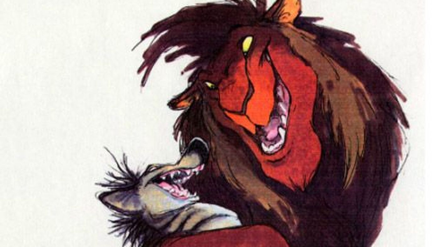
When you think of Scar, you probably think of Mufasa's twisted and sinister brother. With his gaunt, thin frame, his dark color palate, and his fanged smile, he's one of the more visually memorable Disney villains, but there was a time when he was the polar opposite in almost every way.
At first, Scar wasn't a lanky lion, but a large, brutish rogue lion that was more claws than cunning. He also wasn't even related to any of the main cast in any way, the uncle portion was added later to give the lions a more human quality. It was Jeremy Irons's appearance that swayed the animators into this opposite direction, and we can't blame them.
3 Hopps and Wilde: Animal Agents
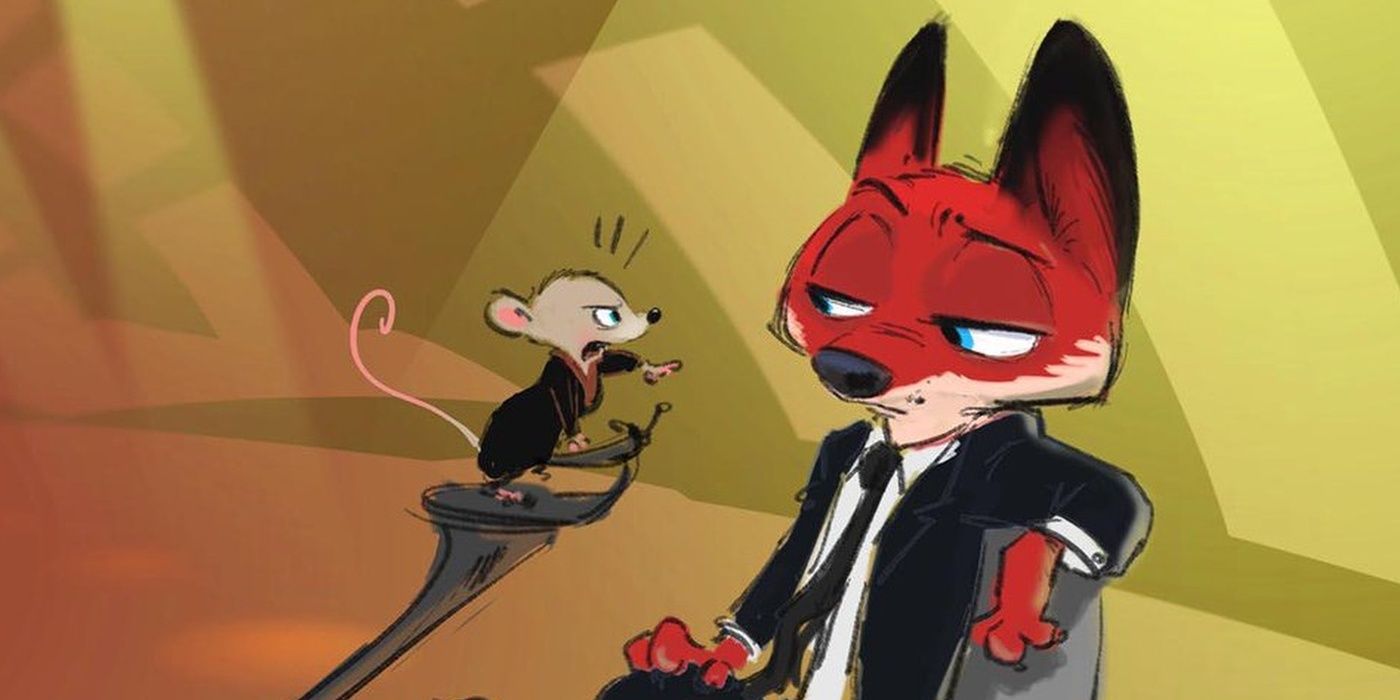
Characters aside, Zootopia went through several drafts for the story and setting alone. At one point, it was even a spy thriller set on an island inhabited by the anthropomorphic cast. This is where we see two different versions of our favorite fox/bunny power couple, Nick and Judy.
At one point, Nick and Judy were meant to be secret agents sent to investigate a caper on the aforementioned island. Nick was to have been the seasoned senior partner and Judy the new recruit. This plot did not come to pass, so the art was repurposed to fit the story we continue to watch today.
2 Wicked Wooden Woody
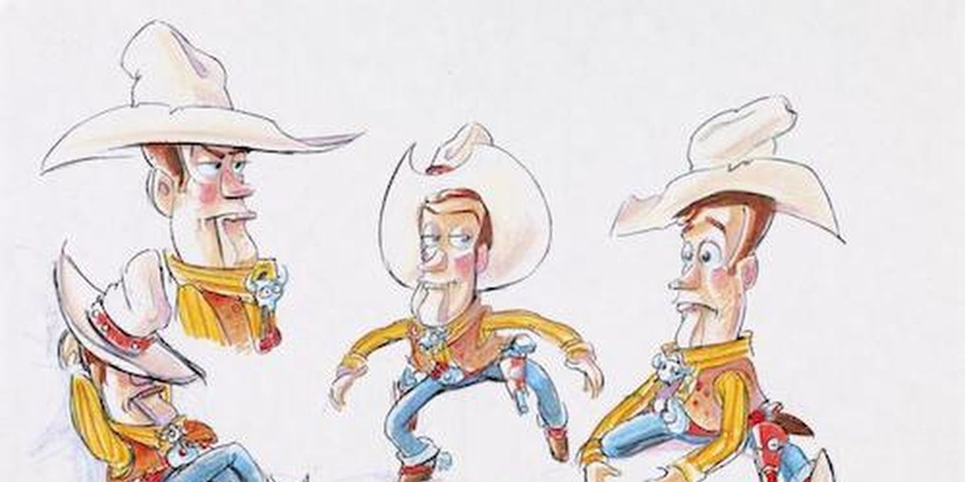
One of the most drastically different characters on our list has to be the leader of the Round-Up Gang himself, Sherrif Woody. In many of the original drafts of the Pixar classic, Woody was actually a ventriloquist dummy akin to Howdy Doody. He was also almost the film's antagonist.
Anyone versed in Pixar lore knows about the infamous "Black Friday" reel. This version depicted Woody as a jealous and domineering toy who forcefully flipped Buzz out the bedroom window and showed remorse. The reel was so shockingly mean-spirited, the script was rewritten into something more friendly and fun.
1 Burton's Black Cauldron
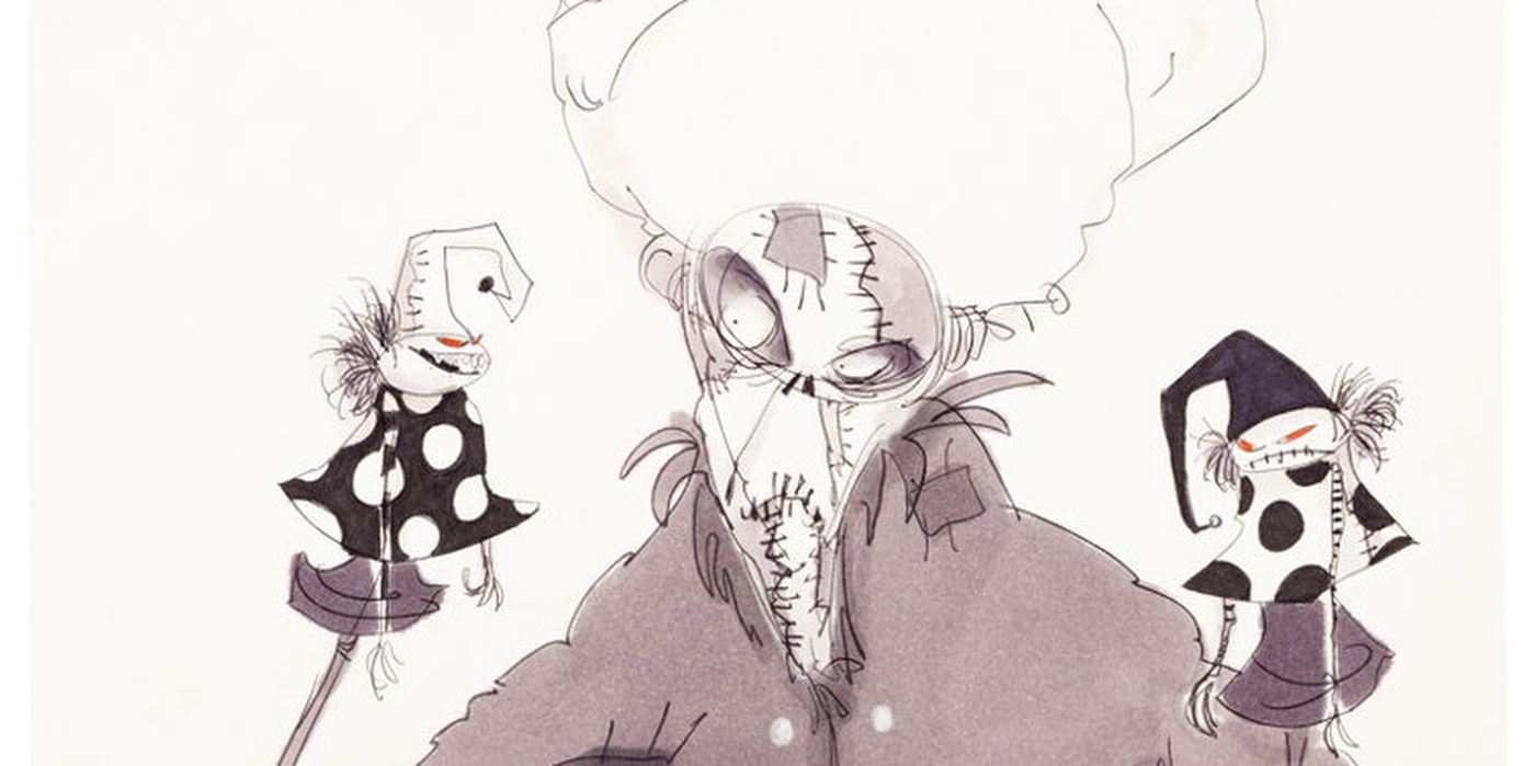
If you weren't already miffed about Katzenberg cutting over 11 minutes from the original Black Cauldron, you can be miffed about scrapping several different characters and concept ideas from none other than Tim Burton. Yes, you read that right.
At this time, Burton was a young, up-and-coming filmmaker who got his start as an animator at Disney. And what better movie to work on for the guy than Disney's darkest film? Unfortunately, his designs were trashed and shortly after, he left the studio. It seems he was just too dark for Disney. They'd certainly change their tune with The Nightmare Before Christmas.
from ScreenRant - Feed https://ift.tt/2phsKeq

0 Comments