House is an amazing show that features a doctor with a horrible bedside manner who can solve the most outrageous cases. He works with a team of doctors who he tends to verbally abuse and fans loved the premise of the show. There hasn't been a new season since 2012, but this hasn't stopped people from viewing the reruns as they pop up on television.
We have found some amazing fan art that fans created in honor of this show. They remind us of the beauty of the characters' personalities as well as showcase different art forms on a single topic. Keep reading to learn about 10 House fan art pieces that leave us watching reruns!
10 A Caricature Describes His Personality
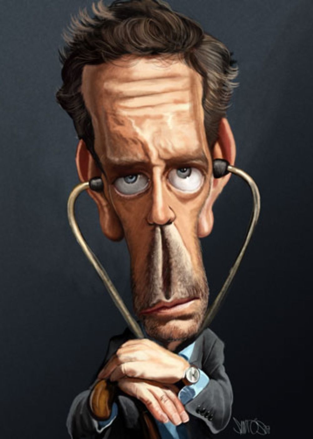
Caricatures are meant to accentuate your features, as well as showcase a personality, and this one does that perfectly. We see Dr. House featured here with a long face and an expression that tells us he is already tired of hearing us speak.
It is hard not to love the realism in this creation between the way the piece was colored and how the artist kept some normal features to really bring Dr. House to life. Nelson Santos created this piece and we can only imagine how he would draw each of us in this particular form.
9 Cartoons Can Be Fun
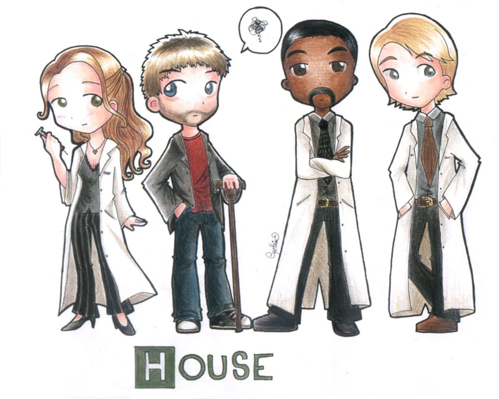
Here we see this artist's cartoon version of the four main characters who were there at the start of the series. We have Dr. House himself, as well as Cameron, Chase, and Foreman. We love how simple it appears with just colored pencils to give each of them dimension.
This piece gives fans a feel of what each of the characters was like as we see a bit of their personalities shining through. PinkNyu did a fantastic job on this work as they recreated some of our favorite characters from the series.
8 Dr. House Relies On His Cane
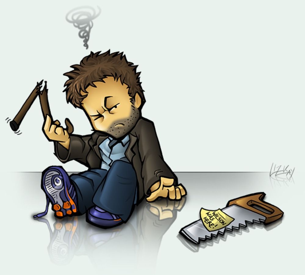
Wilson and Dr. House had a weird relationship in the show as the pair were friends, even though they didn't really act like at times. Dr. House was constantly horrible to him with the things he said, and yet, Wilson was always by his side.
This artist, Lizkay, depicted what Wilson should have done to his cane when he wasn't looking, and we couldn't agree more. We love the way in which this piece was drawn, as well as the disgruntled look on his face when he realizes who the culprit was.
7 A Perfect Portrait
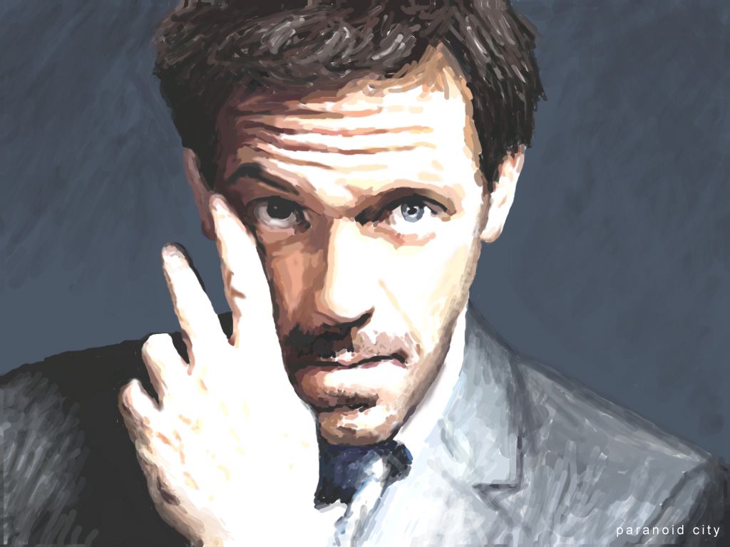
This artist decided to do a painting of their favorite character, who happened to be Dr. House. We love the chunky style they used that adds a sense of imperfection to the piece.
The form is still visible, as well as some key details, but the artist decided to leave some things to the imagination. Paranoidcity created something we could all gaze at for hours as it inspires us to watch reruns for the rest of the afternoon.
6 A Harry Potter Crossover
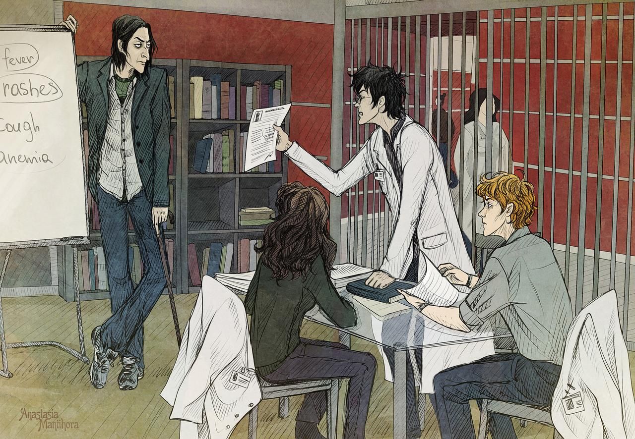
This artist decided to create a crossover between Harry Potter and the House series. We see Snape as Dr. House, and Ron, Hermoine, and Harry as the doctors tasked with finding a diagnosis.
It is an alternative way of looking at things that we find hard not to love, and the drawing itself is eyecatching, to begin with. The various lines Anastasia Mantihora used worked to create dimension in this piece and take it to a whole other level.
5 A Sci-Fi Adventure
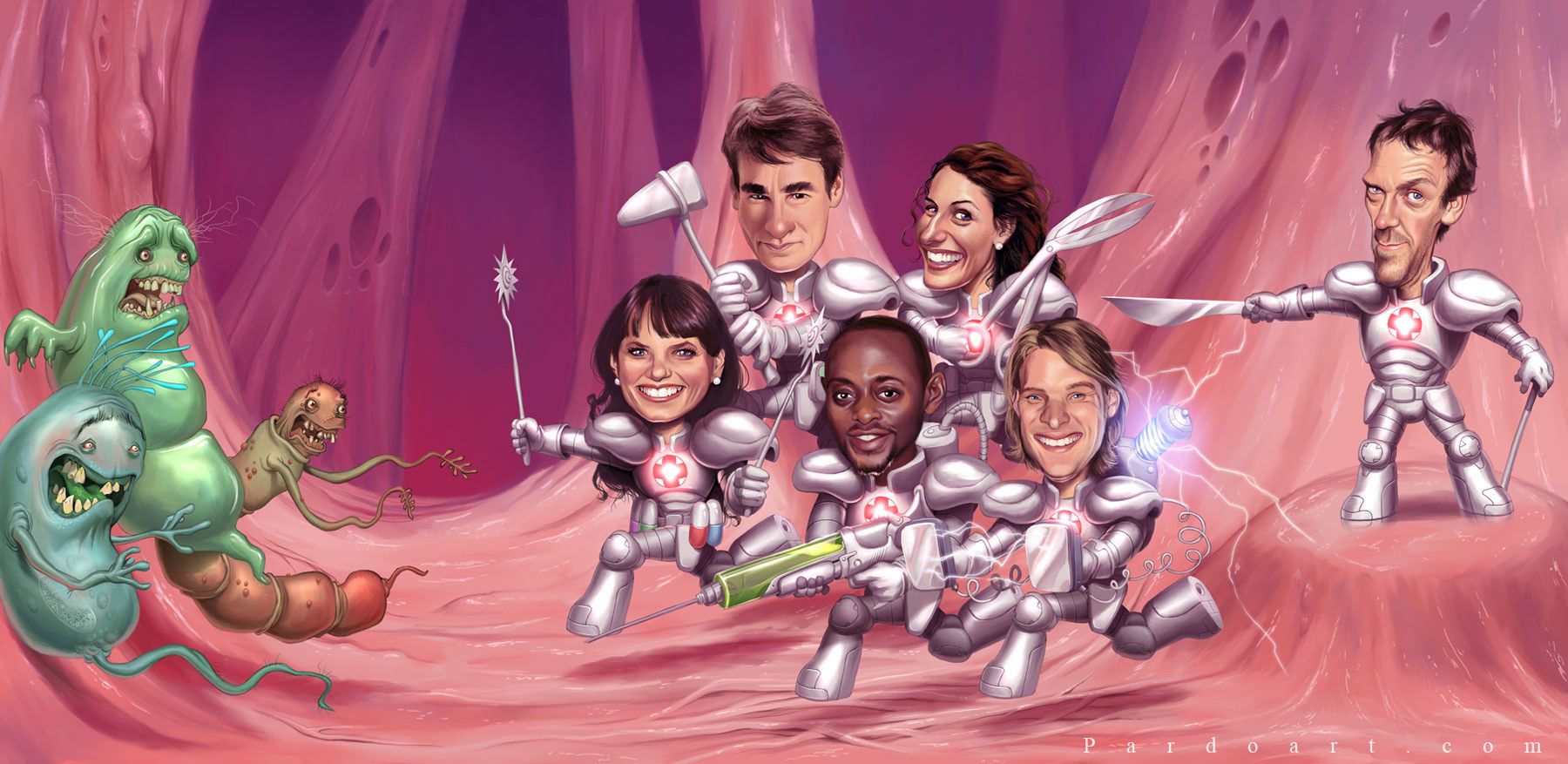
Dr. House and his colleagues are constantly working to battle different diseases, and this artist decided to reimagine their jobs in a sci-fi sort of way. They are each armed with their favorite life-saving weapon as they approach the various diseases with smiles on their faces.
Dr. House is obviously at the helm and we love how each character was depicted. The art itself is spectacular in its composition and Alfonso Pardo Martinez gave us a new perspective on these popular characters.
4 Dr. House Is The Man
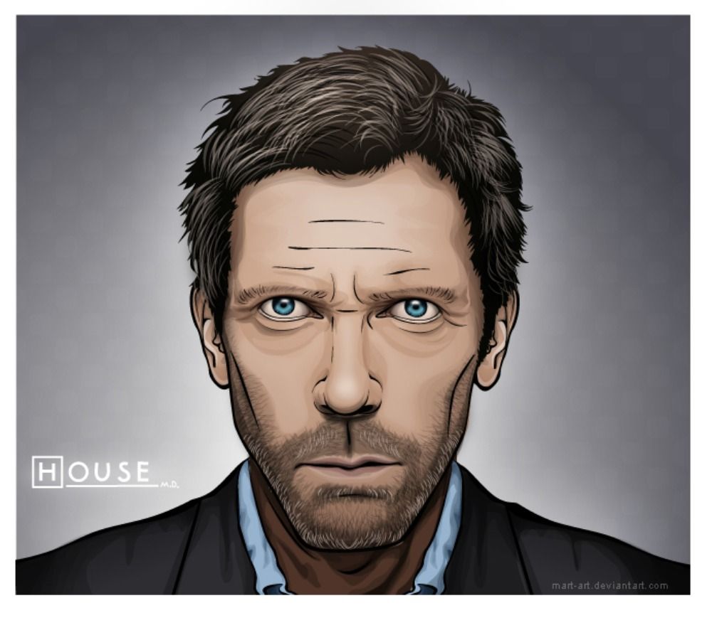
Dr. Gregory House was the star of this show as we followed his personal and medical journey throughout the series. This artist created this piece of vector art in his honor and we love everything about it. They used dark lines to give viewers a solid outline that defined his more prominent features, then went back and made small touches to amp up the amount of detail.
The hair and shading of his skin are what really hit home as it seemingly brings him to life and adds realism to the stare in his eyes. Mart-art did a great job on this piece as he shared a piece of his talent with us by creating this portrait.
3 Little House On The Prairie
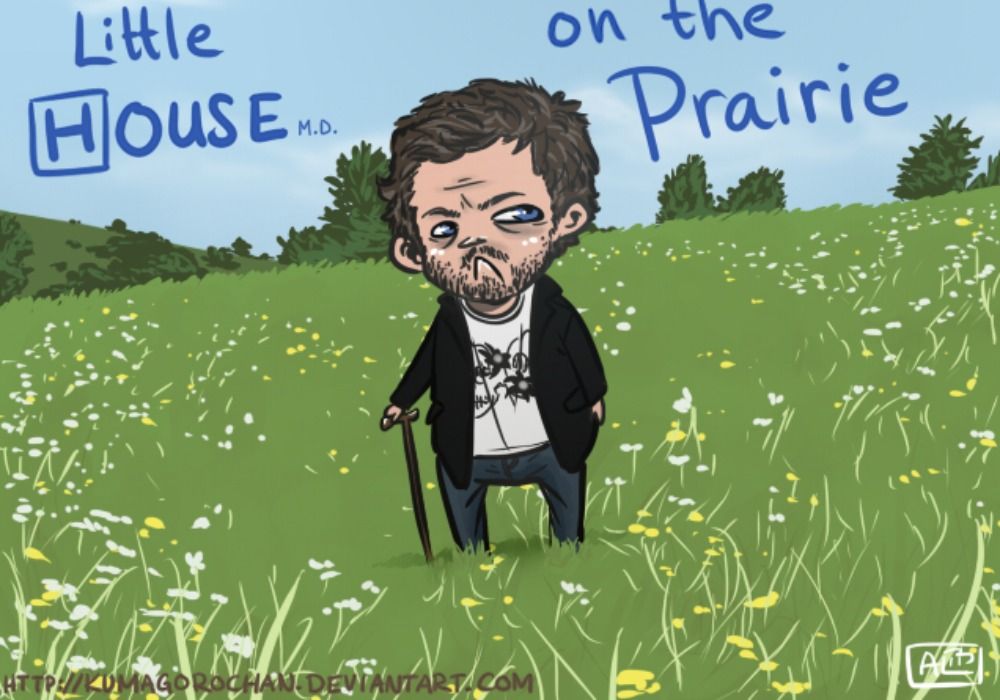
This was a fun play on words as this artist through Dr. House into one place he wouldn't want to be. He belongs in a hospital filled with his favorite drug and not the open fields of undiscovered land. The design of this piece draws us in as we can imagine an entire cartoon based on this alone.
The evident expression of disgust on his face combined with the open fields around him would make for a great story. The artist, Kumagorochan, made something that will bring a smile to any fan's face as they are reminded of the beauty of the show.
2 Pills And Giraffe Necks
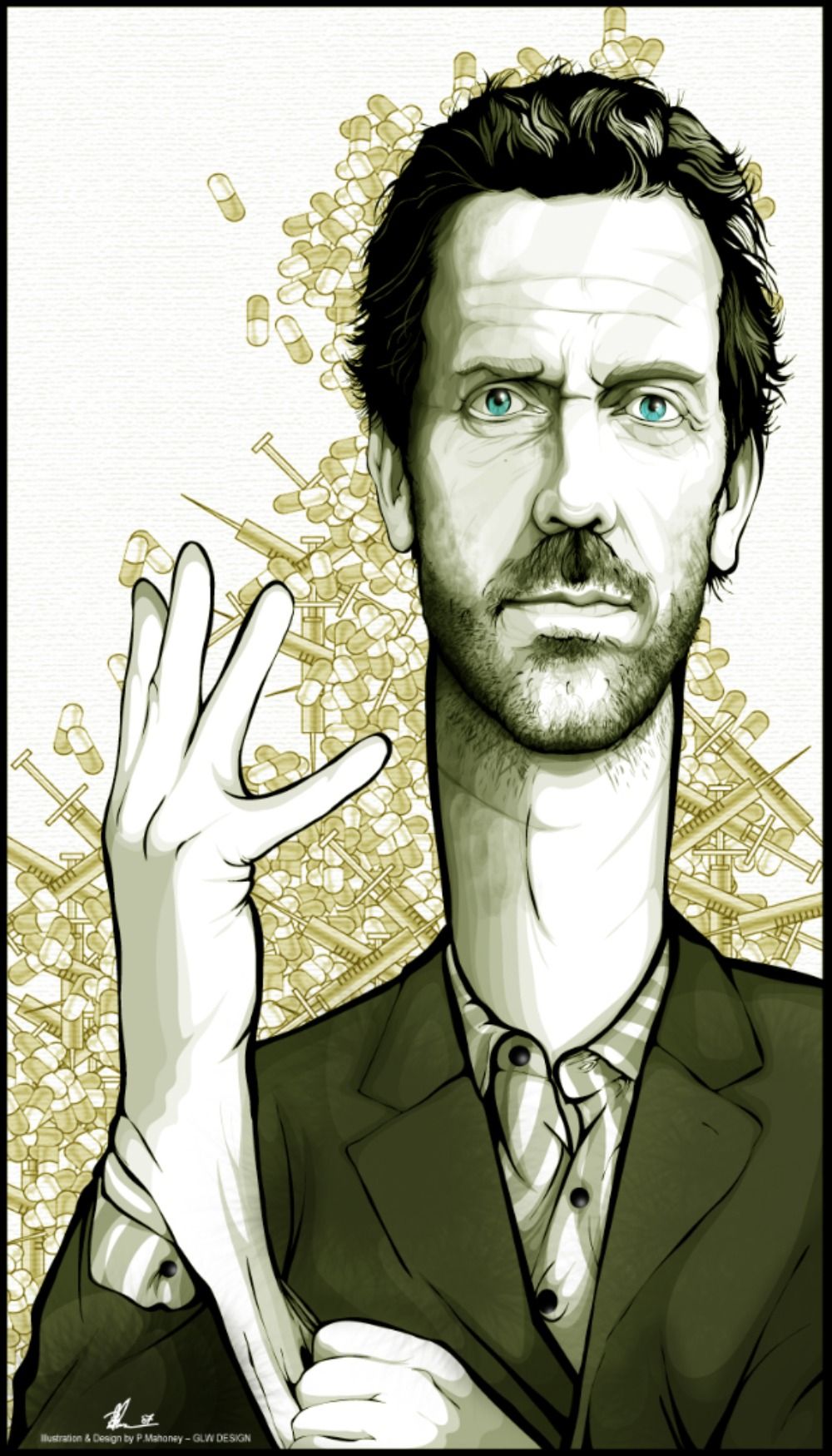
We have seen some pretty crazy renditions of Dr. House up to this point, but this one takes the cake. This artist gave him an elongated neck that reminds us of a giraffe, although, it does match perfectly with his hand. The goal was to emphasize this aspect of the portrait, and some may hate it, but we love it all.
There is so much detail in the light background that helps the foreground stand out as the beard and minuscule wrinkles become more defined. Angelgaby created something different that we can never forget as we are given a new perspective of this timeless character.
1 Meet The Simpsons
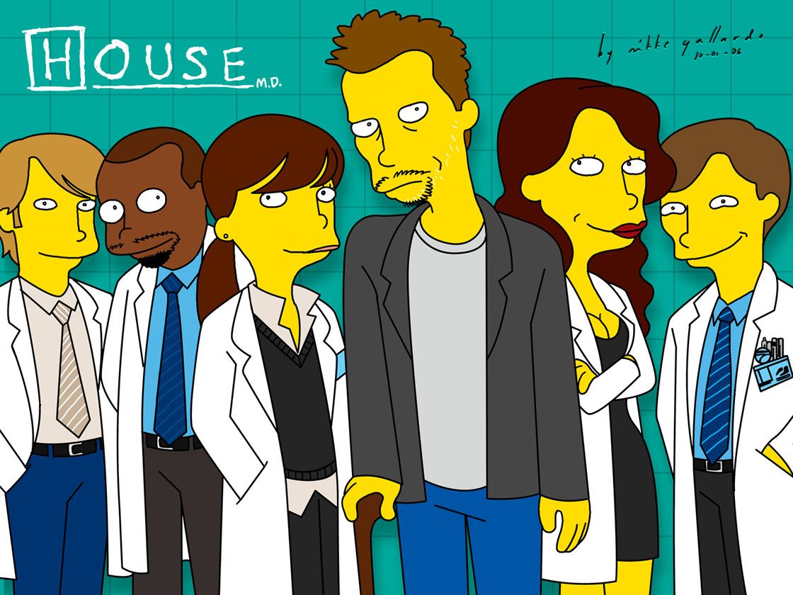
Those fans who love this series, as well as The Simpsons, will love this art piece that combines them both into one. The artist, mikkegallardo, was able to transform the various characters into something completely new, while still keeping their personal attributes.
We see each of them with their typical haircuts, but Dr. House is the most impressive as he carries his stern expression and uncut facial hair into this new yellow world.
from ScreenRant - Feed https://ift.tt/39ySCUW

0 Comments