It is safe to say that the final entry in Disney's Star Wars trilogy, The Rise Of Skywalker, was met with a lot of both excitement and worry before its release. Yet, while it met some fans' expectations, many left theaters unsatisfied following the contrived conclusion to Disney's haphazard sequel trilogy.
The film was even more divisive after release. Nevertheless, before it came out, there was a lot of marketing that got fans either on edge or desperate for it to arrive, and one aspect that never disappoints in Star Wars marketing—even when the movies do—is the posters.
14 IMAX
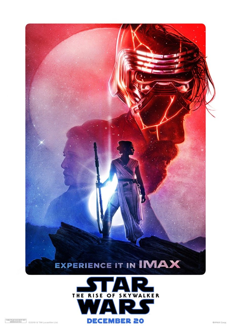
The main IMAX poster is a divisive one and received a lot of criticism when it was first unveiled.
A lot of fans were confused by it and thought it looked awful. Others, though, see it as a beautiful piece and loved the design of the characters. Ultimately, it is confusing, a bit strangely designed, and not that nice to look at, especially compared to other posters.
13 The Cast of Characters
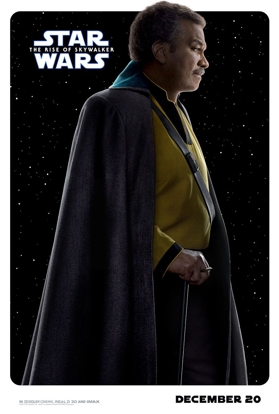
For every one of the sequel trilogy films, a series of character posters are released, showing off the cast of characters that will be involved in the film. The Force Awakens had the best selection with its design and the excitement they incited, but The Rise Of Skywalker versions are not bad.
They fall bottom just by being individual character posters, they get you pumped to see the character, but not necessarily the film as a whole. There is one for Lando, Zorii Bliss, Kylo Ren, Rey, BB-8, R2-D2, C-3PO, D-0, Rose, Finn, Poe, Jannah, and Chewbacca, all on a space background in their various cool costumes, with Lando's sticking out in that regard.
12 The Teaser
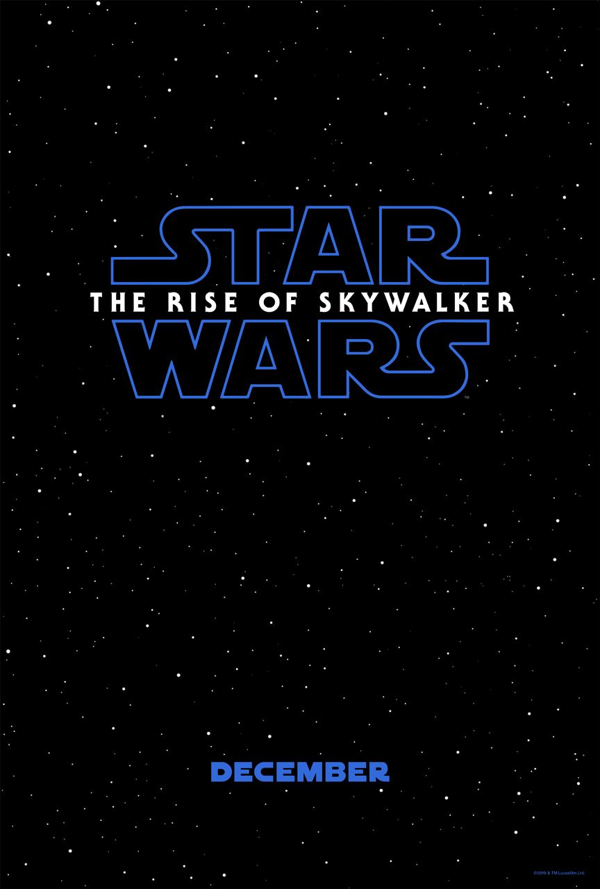
The standard teaser poster that each of the sequel trilogy movies was given returned for The Rise Of Skywalker. There is not much to say about it. It is the logo on a space background, except, this time, the logo for the film is blue, harkening back to The Empire Strikes Back teaser. It gets audiences pumped... so long as they could get past the blue logo.
11 Let The Final Battle... Begin
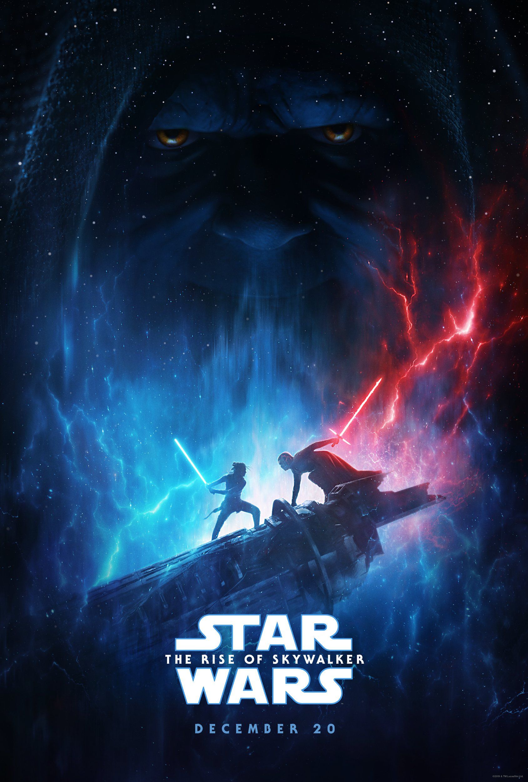
This was another divisive poster amongst fans, but received nowhere near as much criticism as the IMAX poster, and was loved by far more people. It got a lot of people excited, as it contains the film's three most anticipated characters pre-release. But the weird design of them, the possible use of toys, and divisiveness place it low on the list.
10 They Fly Now. They Fly Now? They Fly Now!
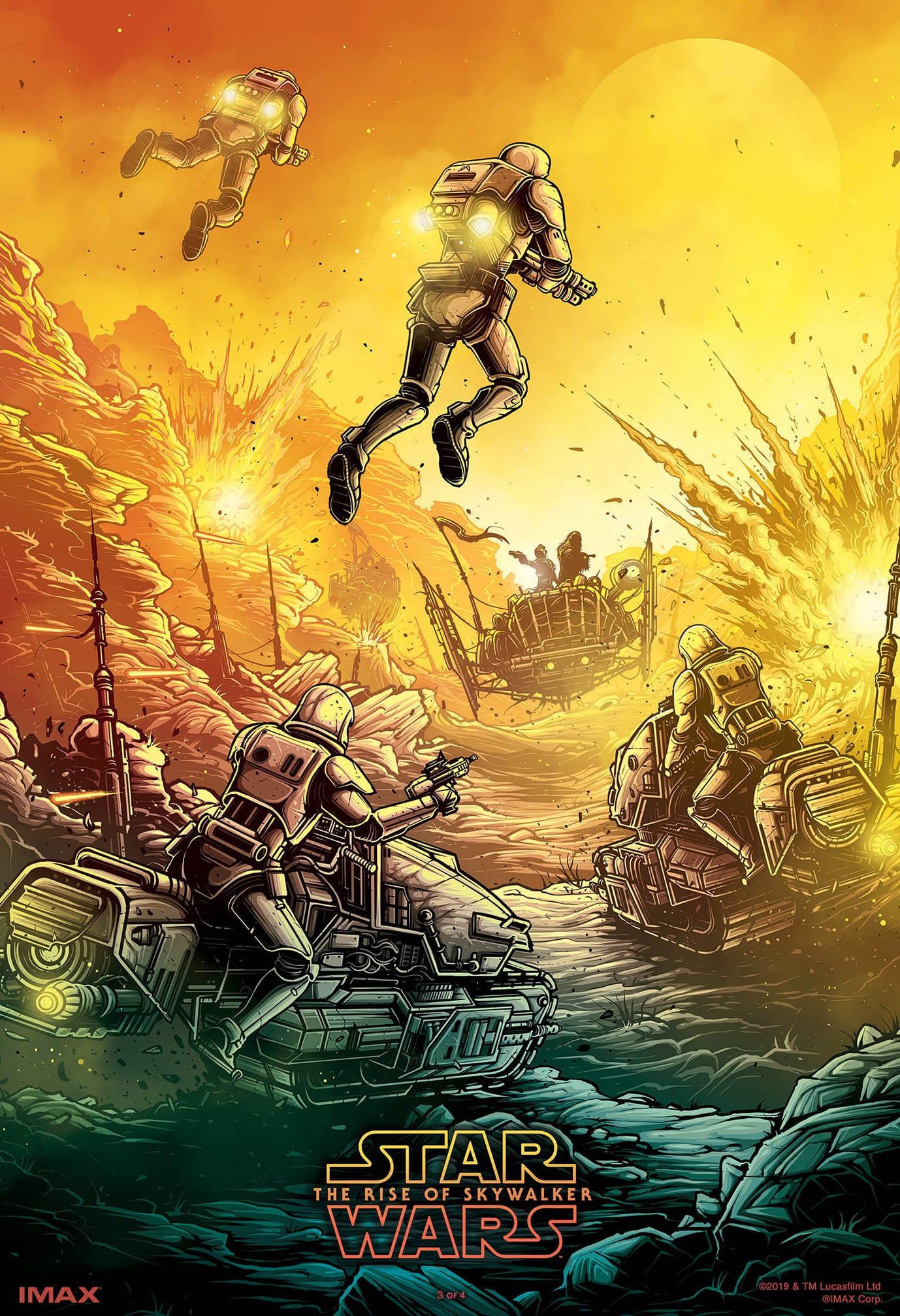
For each sequel movie, there has been a set of four IMAX artwork posters that are beautiful.
The first depicts the stormtroopers flying on Pasaana, with Poe and Chewbacca visible in an escape shooting at the flying troopers. It looks gorgeous but does not represent a scene that fans were excited about, no matter how insanely well done it is.
9 RealD 3D
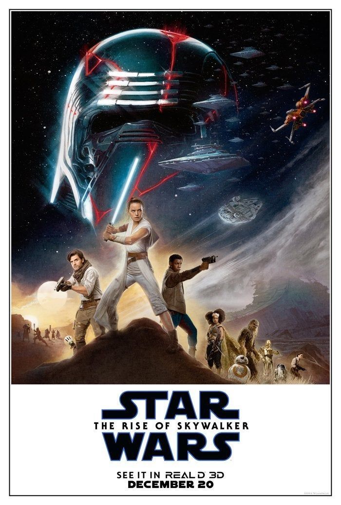
The RealD 3D poster does not look as artistically good as the stormtrooper IMAX one, but it does get you more excited. In particular, the top part with Kylo Ren and the battle between the Star Destroyers, the x-wing, and the Falcon are all great. Even with awkward character placements, it still does a better job than other posters.
8 One Ship Vs. All
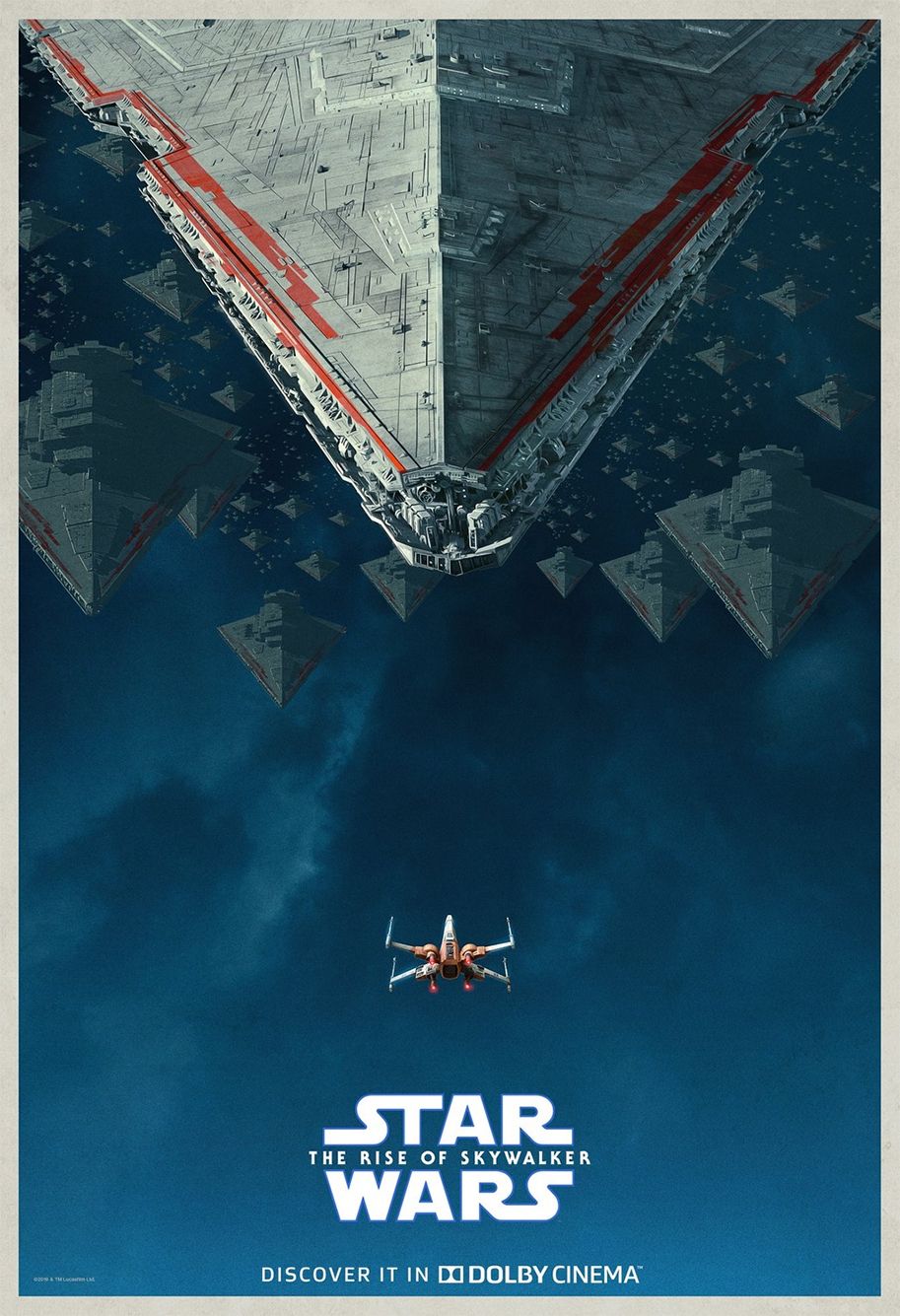
The DOLBY poster for the movie is simple and stunning, depicting a single starfighter taking on an army of Star Destroyers, it shows an underdog, it shows the odds, and it looks fantastic. It gets any fan pumped up for the epic space battle promised by the movie.
7 Battle On Kef Bir
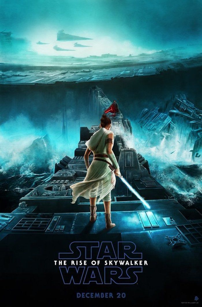
One of the most anticipated things about the film was seeing more of Rey and Kylo together. They are the two standout characters of the trilogy, and their dynamic and relationship is a joy to see every time.
This poster depicts the battle to come on Kef Bir and is illustrated beautifully. The water splashing over the fallen Death Star, Kylo in the distance, the Star Destroyers in the sky—it all looks great.
6 The Story Lives Forever
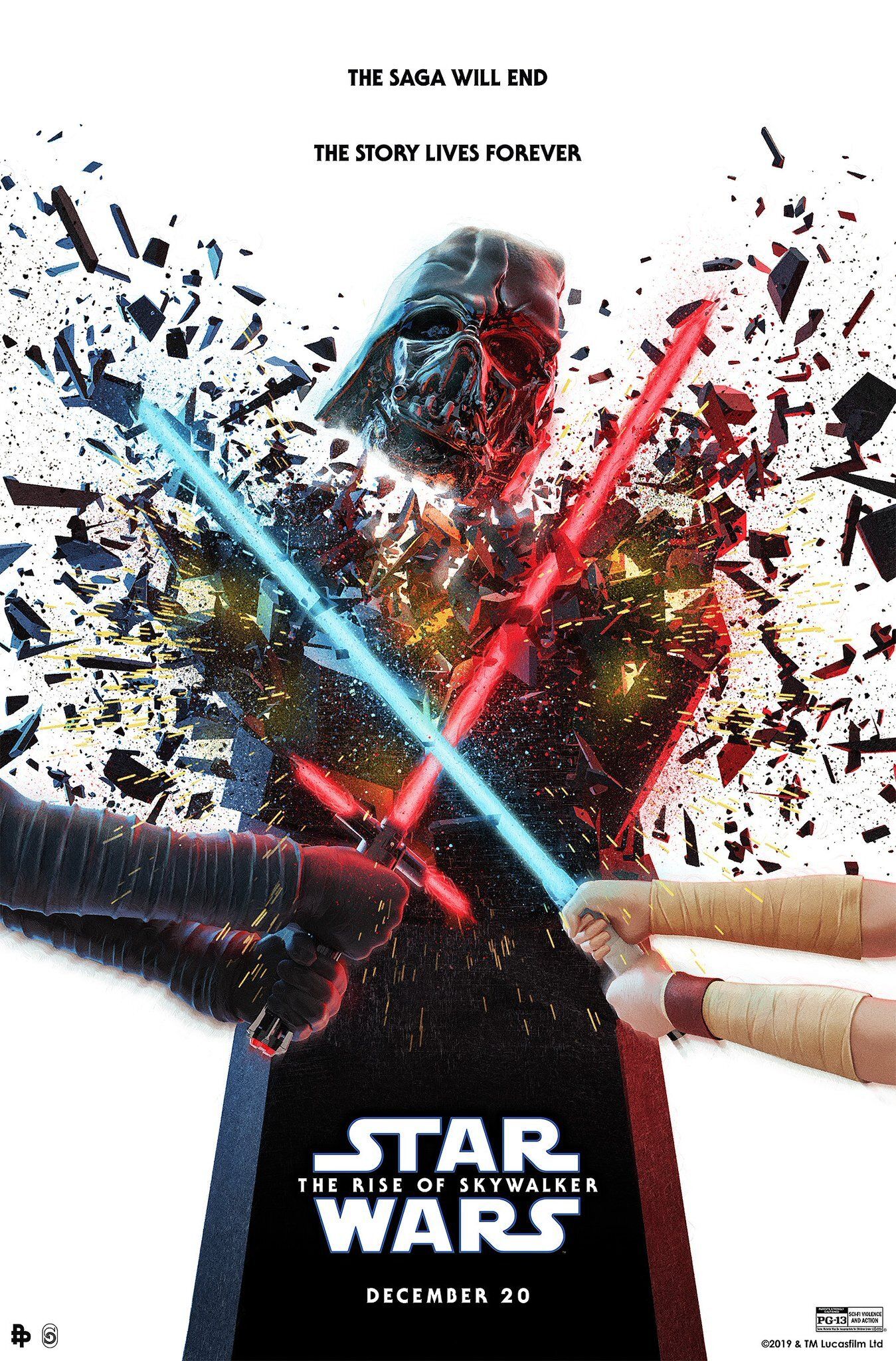
This poster and the above one are pretty interchangeable, and, to be honest, so are most of the posters in the top ten, as all of them are great in various ways.
This poster, though, inspires a lot of curiosity. Promising more than one lightsaber battle, as well as Vader's helmet playing some sort of role, perhaps even getting destroyed.
5 Battle of Exogol
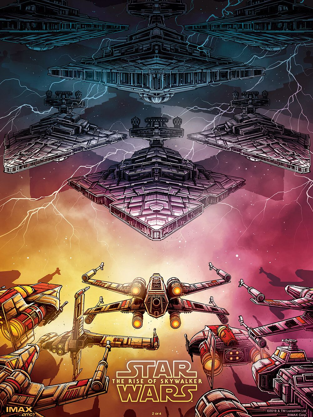
The next IMAX artwork poster to get a spot on this list gorgeously shows the Battle of Exegol.
Seeing the Resistance starfighters face-to-face with a sea of Star Destroyers is both scary and exhilarating, depicted brilliantly in this artwork. The colors are beautiful, and this is another poster that gets you ready for a space battle.
4 The Face-Off
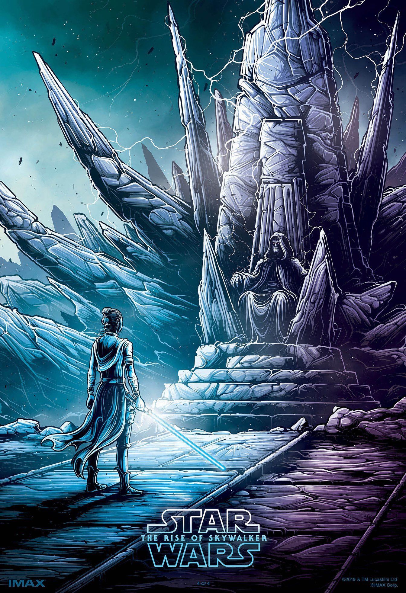
Sticking with the IMAX artwork, this one looks at the meeting between Rey and Emperor Palpatine, and makes it look unbelievable.
Fans were desperate to see how this would go down, and this poster showing the face-off between the sequel trilogy hero, and the series' most prominent antagonist is enough to get you prepared to see it on-screen.
3 Ruined Death Star
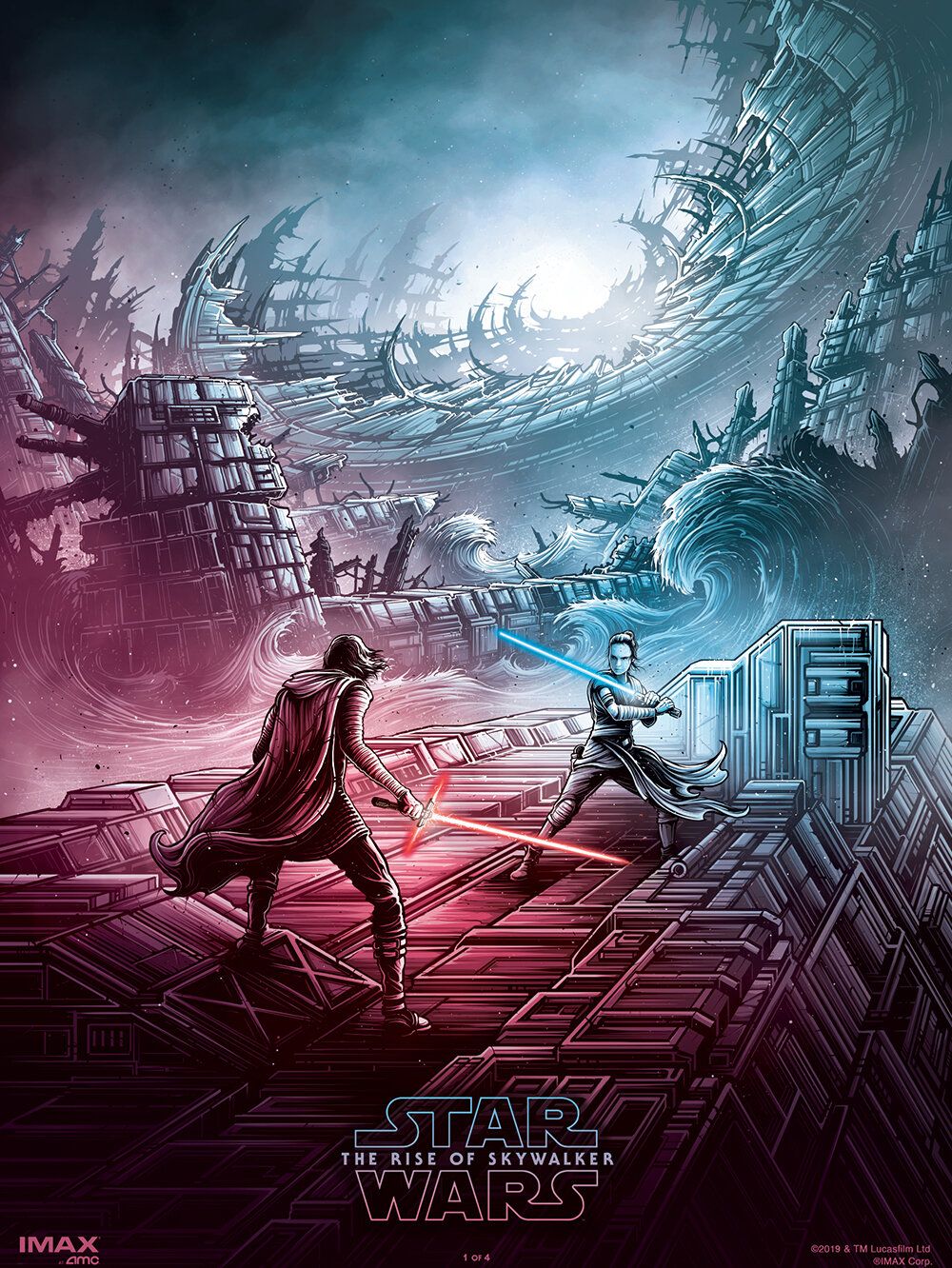
As was mentioned earlier, seeing more Rey and Kylo was the real source of excitement for this movie.
The final IMAX artwork, and the best—all done terrifically by Dan Mumford—shows Kylo and Rey on Kef Bir. The red and blue of the light and dark, along with the design, the masses of water, and Death Star—it is all spectacular.
2 The Classic
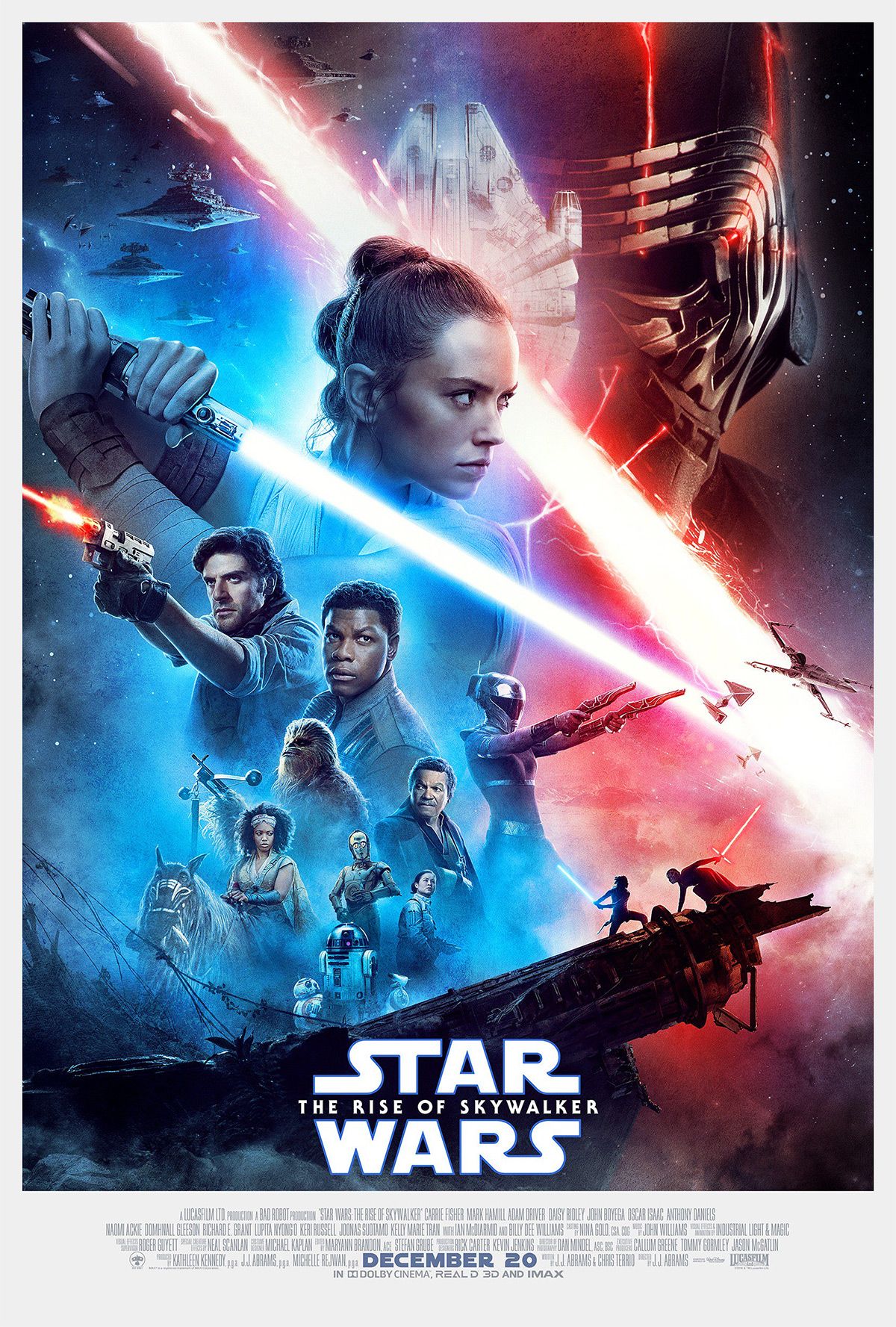
Coming in second is the classic Star Wars design poster. It is photography based rather than illustration, but it is still a welcome sight for Star Wars fans.
The collection of characters and features from the film that have appeared on most Star Wars main posters are always a superb sight. This effort was no different, even if it does miss out on the top spot today.
1 Revenge Of The Jedi
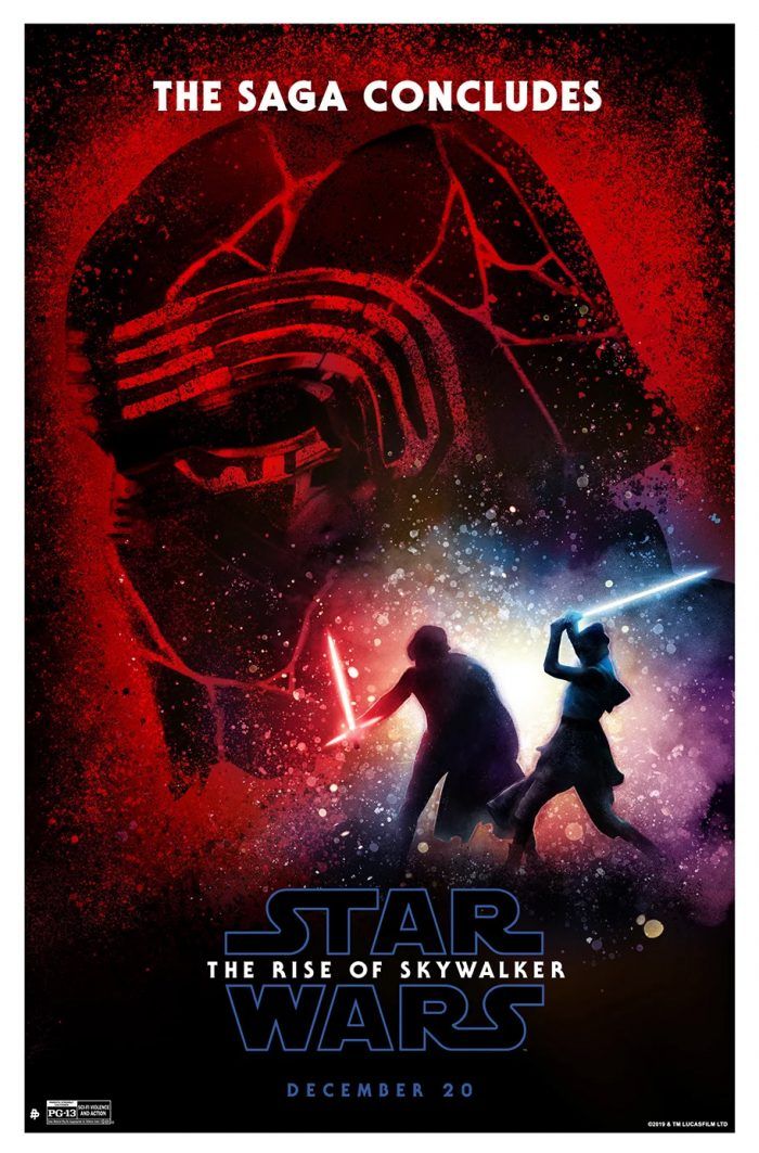
This poster puts a sequel twist on the fantastic Revenge Of The Jedi poster. With Kylo replacing Vader, he and Rey replacing Luke and Vader, with "continues," getting changed to "concludes," it is just a stunning poster. It is designed brilliantly and highlights the best part of the sequel trilogy.
from ScreenRant - Feed https://ift.tt/2QN4pHW


0 Comments