Like the games or not, there’s no First-Person Shooter (FPS) like Call Of Duty. The annual shooter has been going strong for the better part of two decades, with a total of 18 mainline games as of this writing.
Due to the sheer volume of games in the series, it’s inevitable that some titles would overlap and share similarities, and this is obvious in the covers. Where some engender excitement, others only get glossed over when seen on a game store’s shelf. Regardless of the game’s quality, these are the most and least exciting covers of the Call Of Duty franchise.
10 THE BEST: Call Of The Dead (2010)
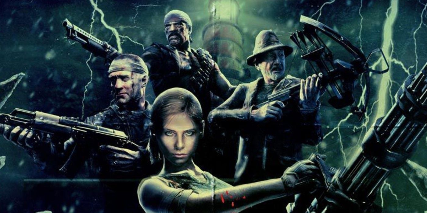
To be fair, literally any Call Of Duty: Zombies poster/cover will send the series’ dedicated into fits of excitement because of just how fun the survival mode is. Each Zombies map has a unique poster but this entry goes to the Black Ops add-on Call Of The Dead, which is the map where four horror movie veterans (namely Robert Englund, Sarah Michelle Gellar, Michael Rooker, and Danny Trejo) get to fight an undead George A. Romero.
All of the Zombies posters reflect their respective level’s pulpy sensibilities that include Wolfenstein-styled World War II horror and Film Noir. However, Call Of The Dead pays the best tribute to the undead subgenre by not only starring Romero himself but actively paying homage to his now legendary Living Dead movies. Besides, who can go wrong with Buffy The Nazi Zombie Slayer?
9 TOO BORING: Call Of Duty: Black Ops 4 (2018)
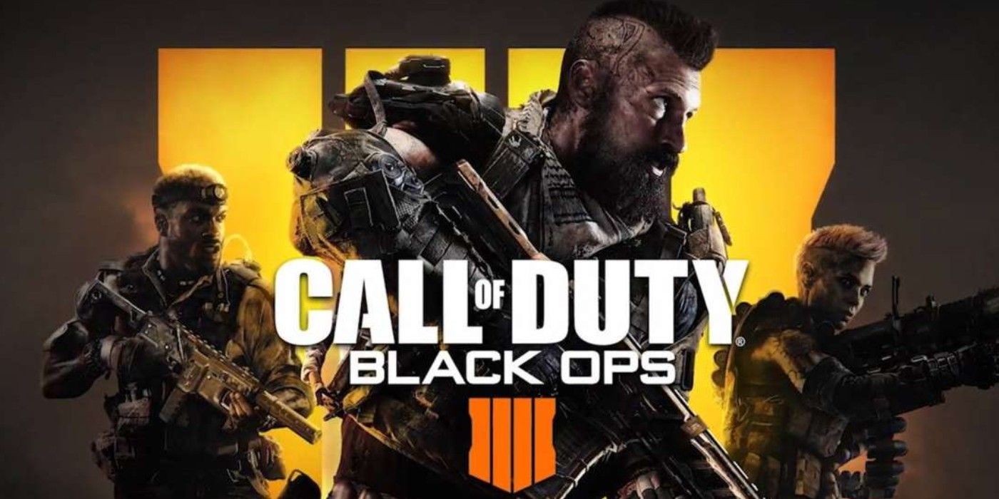
Black Ops games didn’t always live up to their title’s promise when they prioritized explosive action over stealth, and the fourth installment finally gave up all pretense. Featuring three soldiers wielding giant guns that would be anything but stealthy, Black Ops 4 looked more like a Gears Of War multiplayer spin-off than anything remotely sneaky.
The only reason why Black Ops 4 beat out Advanced Warfare (which has the exact same character pose) for this spot is because it boasts three guys posing with guns on its cover, whereas the latter only has one.
8 THE BEST: Call Of Duty 4: Modern Warfare (2007)

While a cover featuring a faceless soldier aiming his gun at the buyer counts as self-parody today, it marked a significant turning point for Call Of Duty and FPS games during the late 2000s. No longer was Call Of Duty set in World War II; instead, it brought players to the modern battlefield, complete with shady politics and nuclear horrors.
Admittedly, Modern Warfare’s cover isn’t the most inspiring, resembling a very green collage of Photoshop assets. But at the time, this was an exciting glimpse at the franchise’s once-bright future. The fact that other shooters and even succeeding Call Of Duty entries (i.e. World At War and even Modern Warfare Remastered) mimicked this cover says it all.
7 TOO BORING: Call Of Duty: Black Ops II (2012)
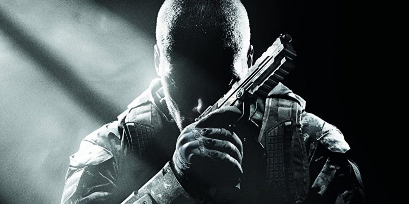
Black Ops was such a hit that Call Of Duty rushed out attempts to replicate its success, and this was embarrassingly blatant in the first sequel. Black Ops II was only made to repeat what Black Ops did, and its cover could be mistaken for a literal photocopy of the first game.
Black Ops II boasts a monochrome image of a guy with guns, posing in a near-identical manner to that of the faceless soldier from Black Ops. But where the latter had an air of mystery and toughness, Black Ops II is just overcompensating and bland, desperate to be mistaken for a superior predecessor. Of Call Of Duty’s many covers, this one looks the one with the least amount of thought put into it.
6 THE BEST: Call Of Duty: Black Ops (2010)
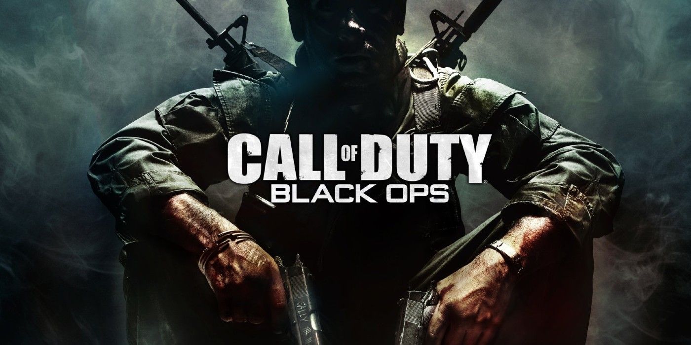
After World War II and fictional parallels to the War on Terror, Call Of Duty set its sights on the Cold War. But rather than going in guns blazing, the franchise snuck its way in with Black Ops. The game’s cover properly reflected this tonal and stylistic shift, obscuring the focal soldier in shadows and negative space while evoking the storyline’s newfound grit and mistrust through what few details are lit.
Like the original Modern Warfare, the first Black Ops cover was a trendsetter for the franchise and a signifier of changing pace. Similarly, it’s been replicated more times than anyone could count, but always to diminishing effect.
5 TOO BORING: Call Of Duty: Infinite Warfare (2016)
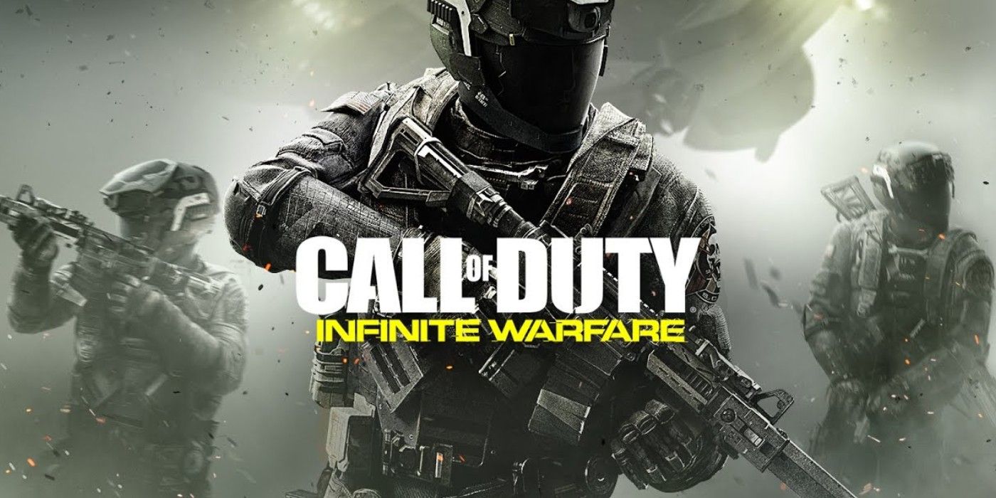
Theoretically, Call Of Duty’s futuristic entries should be imaginative but all they actually did was turn the franchise into a cliché of its own. Nowhere was this clearer than in Infinite Warfare, which is currently the series’ last attempt at bringing warfare to the final frontier.
Infinite Warfare’s cover is basically a repeat of the first Modern Warfare’s, only now with the faceless soldier decked out in clunky power armor. The visual cues are as innovative as a generic cyberpunk story where the evil corporation’s soldiers are faceless stormtroopers. But somehow, these goons are Infinite Warfare’s good guys. The thick greenish/grayish gradient doesn’t help either, obscuring the already stale background while barely doing its job as smoke effects.
4 THE BEST: Call Of Duty: Black Ops Cold War (2020)
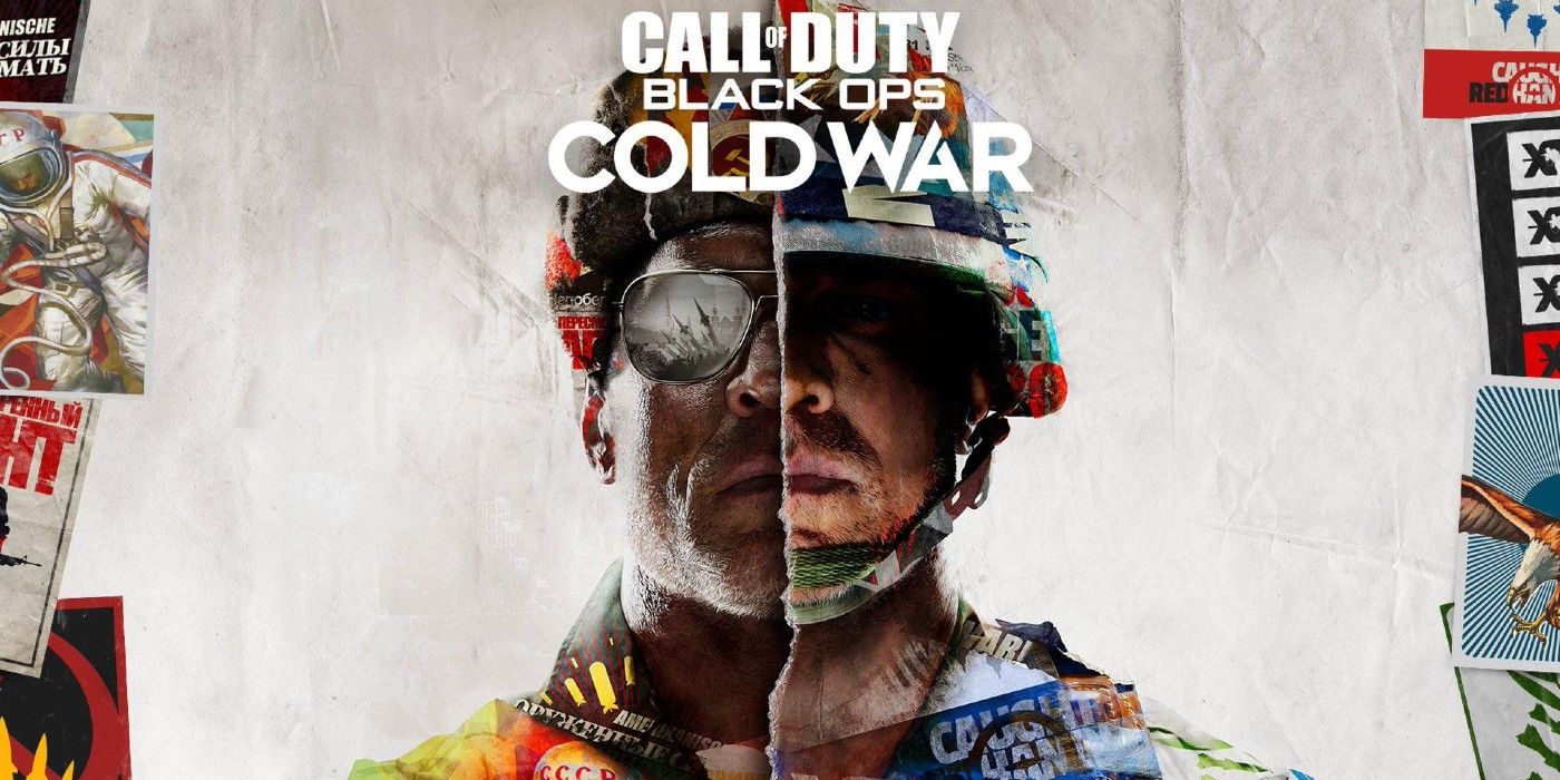
After aping later Modern Warfare games instead of focusing on its title’s unique sensibilities, Black Ops finally returns to its roots in its most recent entry. Cold War is a historical shooter set in the eponymous, decades-spanning clandestine conflict, and its cover does a good job of reflecting this.
Here, two soldiers from the Cold War’s differing sides (broadly speaking, democracy and communism) are shown as one, split only by the poster’s middle tear and the flags of their respective side superimposed on them. This is a simple but effective enough visual summary of the Cold War’s paradoxically clearly-defined yet blurred lines.
3 TOO BORING: Call Of Duty: Ghosts (2013)
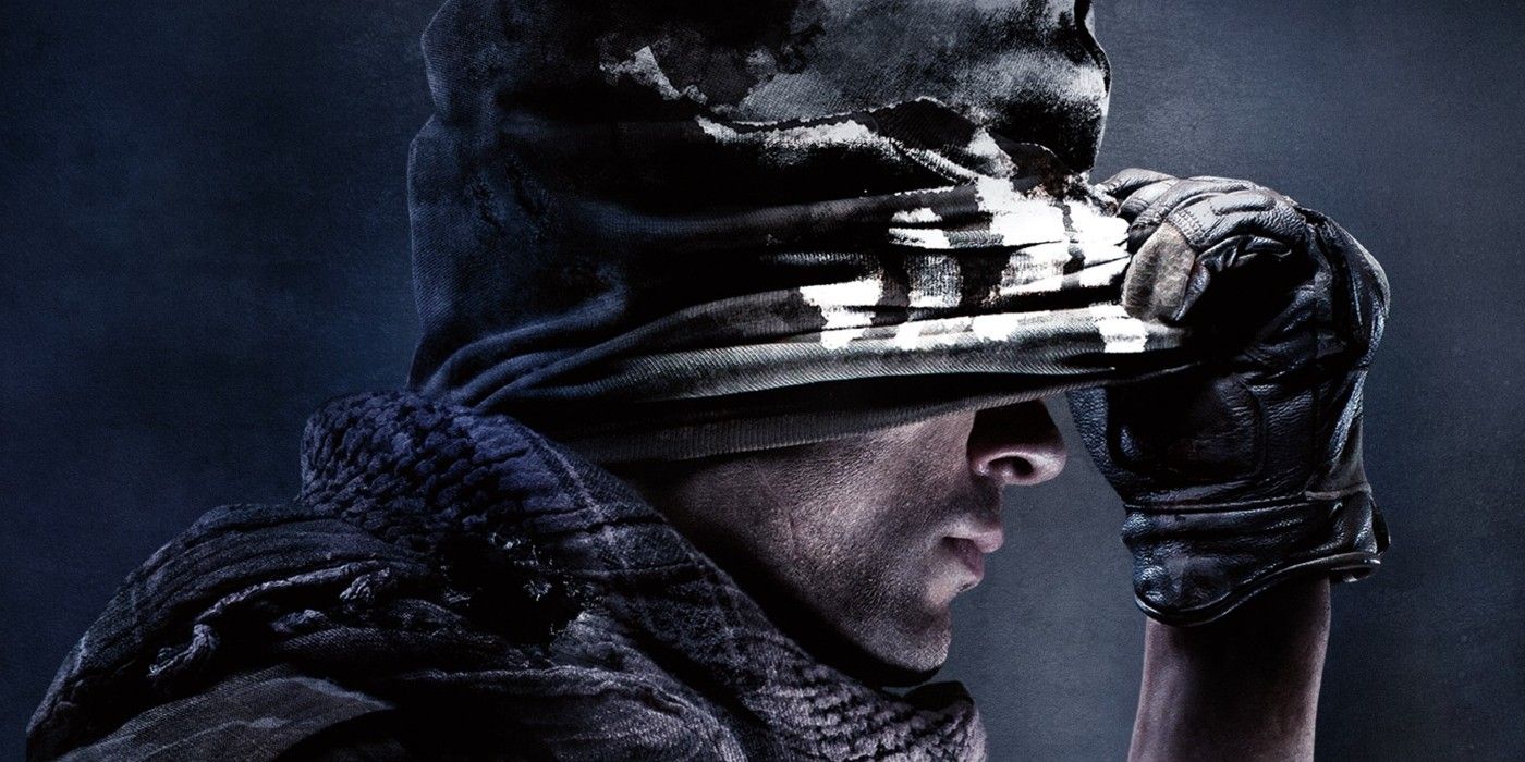
By the 2010s, Call Of Duty just had to slap its title on literally any image to trigger hype among fans. Ghosts is a perfect epitome of this laziness. The game centers on a covert unit of elite soldiers, but players wouldn’t get this impression from a cover that features a guy lifting his face mask menacingly.
Ghosts gets the mention over the conceptually similar WWII because while they both feature some guy’s headshot, WWII at least has an unmistakably vintage aesthetic that clearly shows its time period. Ghosts’ cover can easily be mistaken for literally anything else that isn’t an FPS, like a sports mask ad or a cosplay shoot.
2 THE BEST: Call Of Duty 2 (2005)
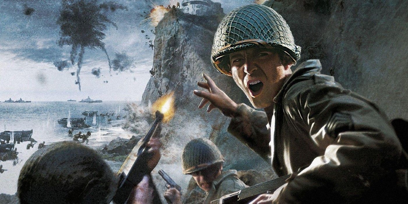
Long ago, Call Of Duty was primarily known as a World War II shooter, and it was during this era that the franchise arguably put the most effort into its covers. Unlike the photo-realism of its successors, the first games appropriately evoked the vintage patriotic look of wartime propaganda, with the second being the best.
This cover depicts American soldiers charging at a German fortification during D-Day (June 6, 1944) in stunningly painted art that wouldn’t feel out of place in an old-timey recruitment center or the background of Captain America: The First Avenger. Meanwhile, the first is a bit too dark while the third, for some reason, has its focal soldier firing his gun at the buyer while his comrades run at a castle in the opposite direction.
1 TOO BORING: Call Of Duty: Modern Warfare (2019)
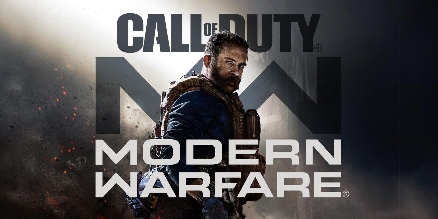
In terms of cover art and creativity, the newest Modern Warfare is the franchise at its most boring and rote. All this cover has is famed character Capt. John Price standing against what can only be generously described as a cloud of dirt. Aside from that, the title text is just slapped behind and/or in front of Price.
Call Of Duty’s later installments have been criticized for lazily repeating whatever its predecessors did and this is painfully transparent in everything about Modern Warfare, from gameplay to cover. No longer was Call Of Duty interested in inspiring newcomers or redefining shooters; all it wanted to do was play its Greatest Hits on loop.
from ScreenRant - Feed https://ift.tt/34nRwuE


0 Comments