Everybody has their favorite superhero, but there is no denying that Spider-Man is one of the most popular crime fighters. He first appeared in Amazing Fantasy #15 in August 1962 and was created by Stan Lee and the late Steve Ditko.
Spider-Man can do anything a spider can including the abilities to climb up walls, super-human strength, speed and agility as well as a precognitive spider-sense.
Spider-Man has not only appeared in the pages of comic books for years, but has also been the star of multiple TV shows and films.
In the early 2000s, San Raimi crafted his Spider-Man trilogy starring Tobey Maguire as Peter Parker a.k.a. Spider-Man. The films brought in a lot of money for Sony and Spider-Man even stood as their all-time highest grossing film until Jumanji: Welcome to the Jungle was released in 2017.
While all three films brought Sony a lot of money, Spider-Man 3 didn’t do as well with critics which caused them to reboot the series with Andrew Garfield in The Amazing Spider-Man movies.
Garfield only got two films as the famous web-slinger before Tom Holland took his place in the Marvel Cinematic Universe.
With the number of films that have been released, there is a magnitude of concept artworks that are sometimes better than what showed up on screen.
Here are 30 Unused Spider-Man Concept Art Designs Better Than What We Got.
30 A Very Different Green Goblin
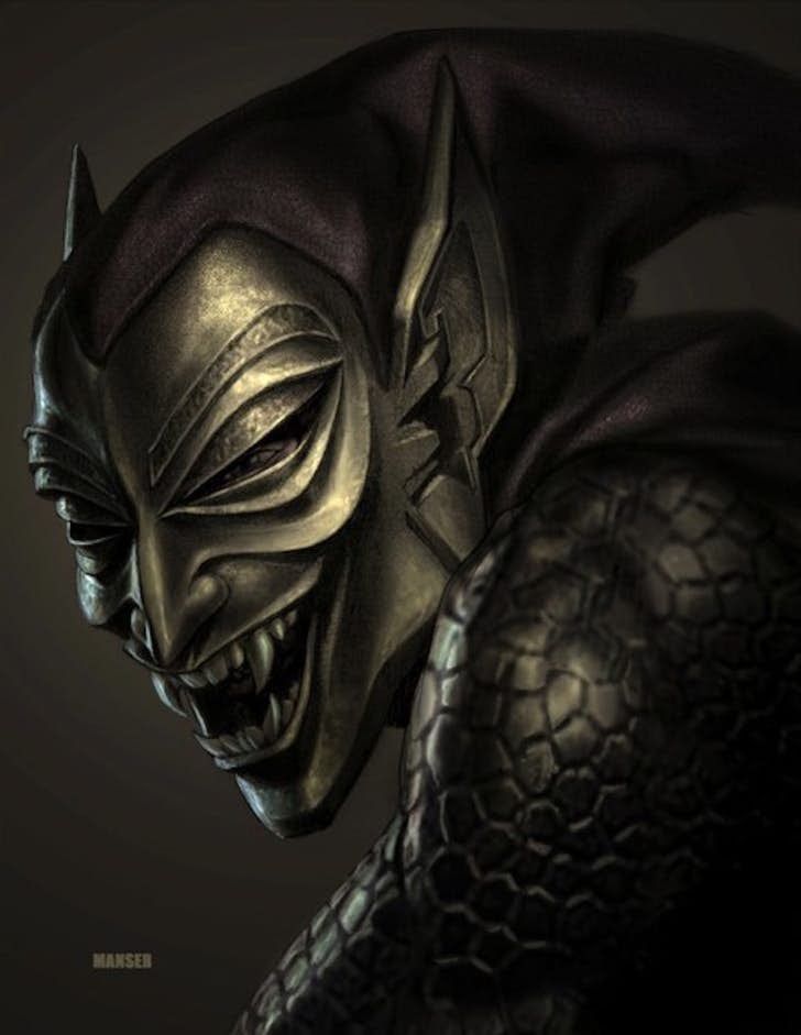
Spider-Man has many enemies, but the Green Goblin is widely considered his arch nemesis.
The character’s appearance and costume have changed a lot over the years. This concept art for Spider-Man shows what the Green Goblin could have looked like in the 2002 movie.
The final version was created to look more like military armor than anything else.
While this version still has an armor-like appearance, it has many more traits of the original costume from the Green Goblin suit in the 1960s.
29 Spider-Man 2’s Original Villain
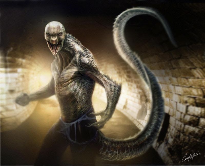
While Alfred Molina’s Doc Ock was a memorable villain in Spider-Man 2, he wasn’t originally what Sam Raimi had intended.
When Spider-Man 2 was announced, Alfred Gough and Miles Millar crafted a script that included Doc Ock, the Lizard, and Black Cat as the villains for the sequel.
Thankfully it didn’t happen since having more than one villain often hurts a superhero film but seeing Raimi’s version of the Lizard would have been neat.
Dr. Curt Connors did appear in Spider-Man 2 and 3; however, he never transformed into the villain the Lizard. This concept art shows what the villain could have looked like in Spider-Man 2.
28 Cool Guy Goblin
Most people didn’t mind when Willem Dafoe became the Green Goblin, but when it was James Franco’s turn in Spider-Man 3 people turned against the character.
To be fair, Harry Osborn didn’t turn into the Green Goblin, but instead, a character called New Goblin. What was even lazier than the character’s name was the writing behind the character.
Almost nothing from the Green Goblin translated well on the big screen and the end result was just awful.
This concept art isn’t too far off from what fans got, but at least they got rid of that popped collar and sunglasses.
27 Is That Ash Williams Or Mysterio?
Before it was announced that Sony would be rebooting the Spider-Man series, Sam Raimi and his team had already begun working on the unreleased Spider-Man 4.
While the film never saw the light of day, many concept designs have come out and revealed what Raimi had in mind for the sequel.
One character that Raimi was going to include in Spider-Man 4 was Mysterio who would have been played by Raimi’s good friend Bruce Campbell.
Campbell had a cameo role in each of the Spider-Man movies but this would have been his biggest role in the series to date.
26 The Alternate Spidey Suit
Even though Spider-Man 4 had been canceled, Sony was quick to announce that Spider-Man would be making his way back to the big screen.
Andrew Garfield was chosen to wear the suit with Marc Webb directing. The filmmakers had a daunting task ahead of them since the original Spider-Man trilogy had been adored by a lot of fans.
The new Spider-Man suit was quite different than the one Maguire had worn, but it was almost even more different.
This concept art shows a radically different version of the Spidey suit including long slanted eyes, an off-centered spider logo, and webbing underneath the arms.
25 Classic Electro

Electro, a.k.a. Maxwell Dillion has been a part of the Spider-Man comic books since 1964 when he appeared in The Amazing Spider-Man #9.
For the longest time, Electro had a yellow and green suit with a mask that represented bolts of electricity. Eventually, he had a blue and white appearance which was chosen for The Amazing Spider-Man 2.
While Jamie Foxx did a great job in the villain role, original concept art showed the character with the classic green and yellow colors.
While the blue didn’t look awful in the film, many fans would have much rather seen Foxx sport Electro’s classic colors.
24 Miles Morales' Spider-Man Suit
When Tom Holland appeared in Captain America: Civil War as Spider-Man, the character’s costume was again drastically changed from the look of the previous actor.
Spider-Man’s suit really didn’t change all that much from Captain America 3 to Spider-Man: Homecoming but it almost looked very different.
As this concept art shows, Peter Parker almost sported a suit that is eerily similar to Miles Morales’ black and red costume.
The character was briefly teased through Donald Glover’s character Aaron Davis-the uncle of Miles Morales- but this suit would have further hinted at Morales’ future inclusion.
23 Sam Raimi’s Mechanical Web Shooters
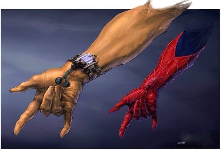
In the original Spider-Man comic books, Peter Parker has mechanical web shooters that he built himself for his Spider-suit.
Having Parker build his own web-shooters helps explain Peter’s brilliance as an inventor and a scientist; however, Raimi didn’t adapt this part of the comic books.
Raimi’s movies ended up going a different route explaining that Peter Parker developed organic web-shooters after the radio-active spider bit him.
While it wasn’t a huge issue with Peter’s arc throughout the trilogy, most people would have liked to see mechanical web-shooters. This concept art shows that at one point, Raimi was considering this as a possibility.
22 Doc Ock With A Cape
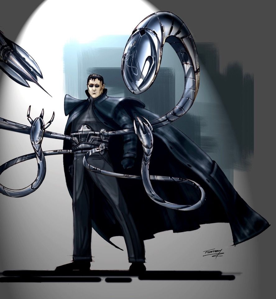
Everything about Alfred Molina’s Dr. Otto Octavius was accepted by most fans. His trench coat, fedora, and sunglasses weren’t necessarily a poor costume, but they almost looked very different.
This concept art for Spider-Man 2 shows a Doc Ock wearing all black and a long cape.
His tentacles are also much more sleek in this concept art possibly drawing inspiration from the Ultimate Spider-Man comic series.
The final version of Doc Ock’s tentacles was very visually appealing, but this version of the character gives off a much more villainous vibe.
21 Penny’s Sandcastle
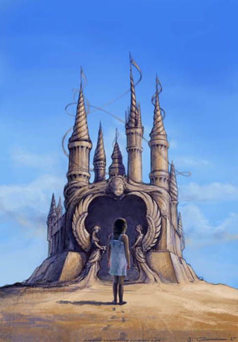
There aren’t a lot of great moments in Raimi’s Spider-Man 3; however, the sequence in which Sandman is created is one example of amazing special effects.
Throughout the film, Thomas Haden Church’s character Flint Marko appears to be a very devoted father.
Even though he is a criminal, his inspiration for what he does is his sick daughter Penny.
Although there isn’t context behind this concept art, it appears as though there was initially going to be a scene where Penny walks into a giant sand castle built by Sandman which could have been a very captivating scene to see.
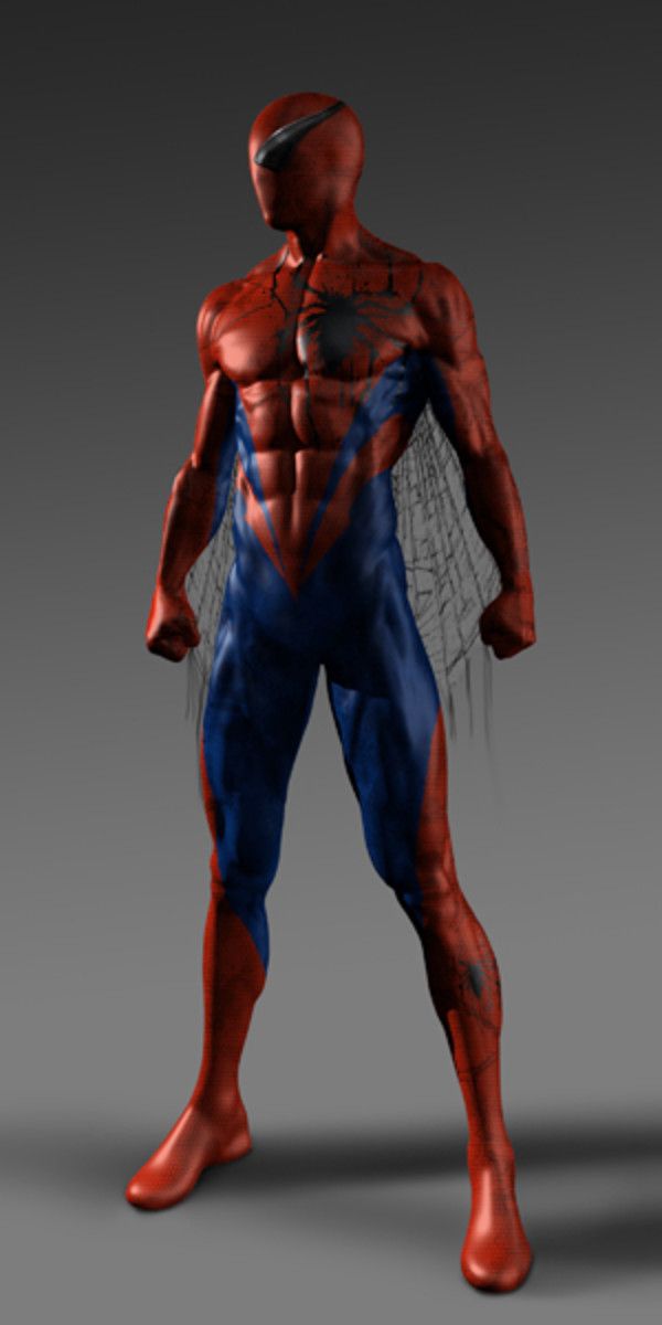
20 A Radically Different Spider-Suit
Spider-Man is most known for having a red and blue suit. Sure, the character has had some alternate suits over the year including the famous black Symbiote suit, but mostly he sports red and blue.
When costume designers were coming up with ideas for the next version of Spider-Man’s costume, Ed Natividad came up with this design.
While it may have not gone over well with a lot of fans, it would have been radically different than any other version of the suit.
Sometimes radical isn’t always bad especially if one is trying to come up with a fresh version of an already popular character.
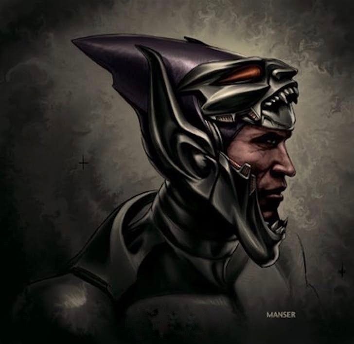
19 A Literal Green Goblin
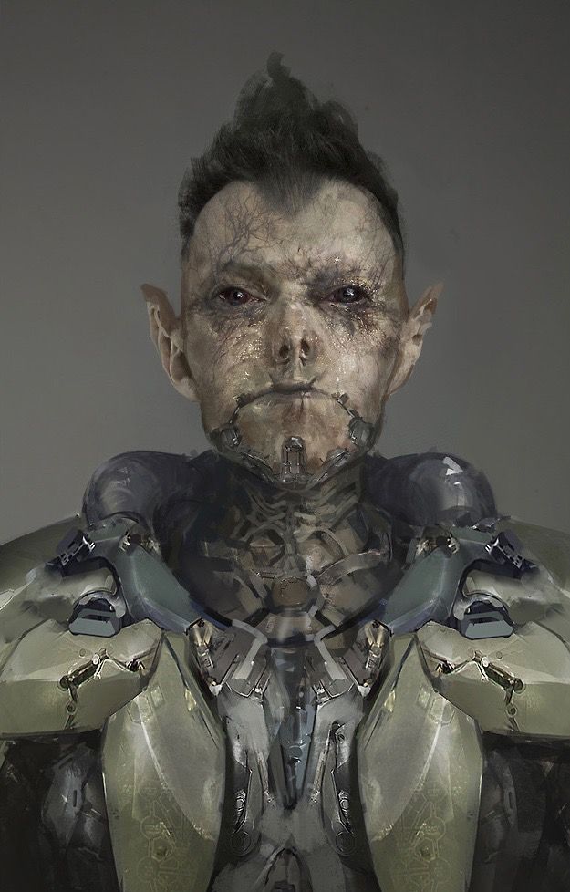
In Marc Webb’s The Amazing Spider-Man 2, it was revealed that the Osborn family suffers from a disease called Retroviral Hypodisplasia.
This disease took the life from Norman Osborn and Harry had begun to have symptoms of the disorder.
Retroviral Hypodisplasia apparently causes its victims to have internal pain and external changes including scaly skin and a rapid development of nails and teeth among other symptoms.
While Harry suffered from this disease in the movie, original concept art shows him being much more affected by the disorder making him look like a literal green goblin.
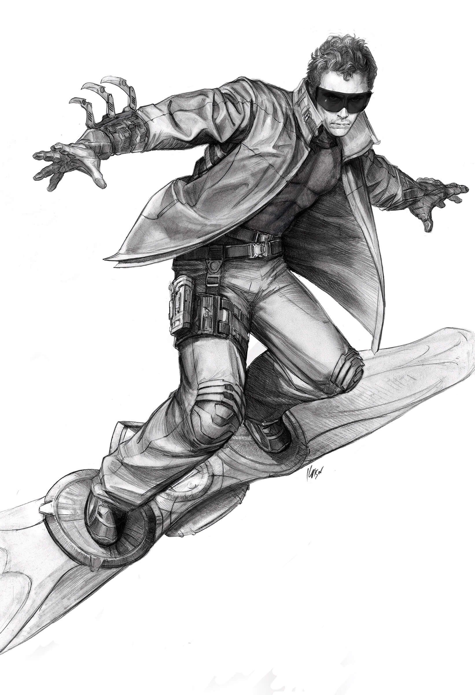
18 The Scarlet Spider Suit
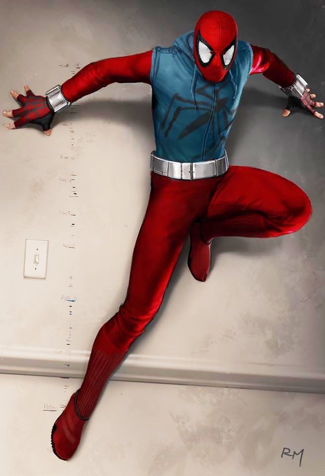
Before Peter Parker is given the high-tech version of his Spider suit in Spider-Man: Homecoming, he is swinging around the city with a homemade costume that looks very amateurish.
Although the hoodie and fingerless gloves look like an amateur costume, the overall look appears to bear resemblance to the iconic Scarlet Spider suit worn by the character Ben Reilly.
This concept art revealed by Marvel Studios' Head of Visual Arts Ryan Meinerding shows an early draft of the homemade suit that looks exactly like the Scarlet Spider costume.
17 The Opening Goblin Mask
Willem Dafoe’s Green Goblin no doubt had a unique look, but he almost had an awesome helmet.
In a scene in the final cut of the movie, Norman Osborn takes Spider-Man to the roof of a building to tell him that eventually, people will turn on him.
During this conversation, viewers see that the Green Goblin’s yellow eye guards are retractable.
As this concept art shows, the helmet itself was almost able to open up revealing Norman’s full face. It’s also worth mentioning that this version still had the purple color integrated into the design of the cone helmet.
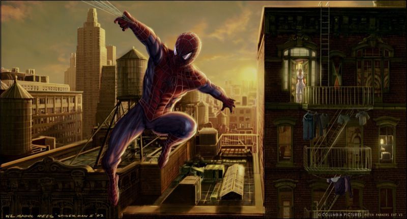
16 Rooftop Robbery
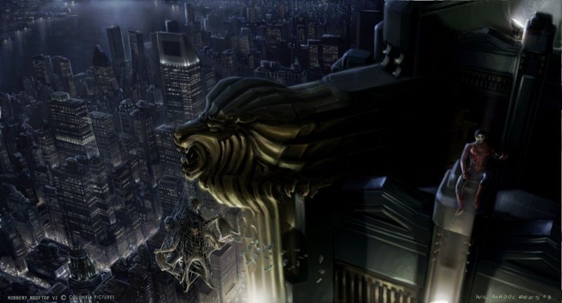
There are many captivating scenes in Spider-Man 2, but this one potentially could have topped them all.
This concept art shows an unmasked Peter Parker sitting atop a building in New York.
While this happens in the film, there was never a scene that had robbers webbed up to a gargoyle on top of a tall skyscraper with money flowing in the wind.
Spider-Man 2 won an Oscar for Best Achievement in Visual Effects so a scene such as this would not have been out of reach in 2004.
15 Spider-Man At The Osborn Estate
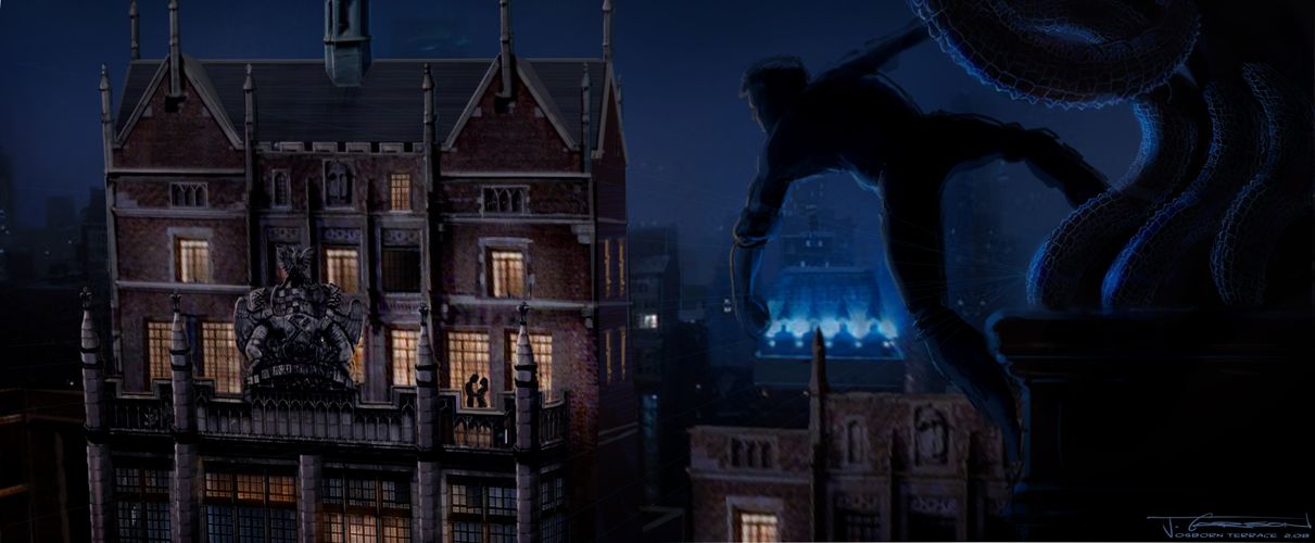
Harry Osborn and Peter Parker’s relationship were put to the test in Spider-Man 3. At the end of Spider-Man 2, Harry found out that Peter was Spider-Man and in turn, blamed him for his father’s fate.
Spider-Man 3 deals with the outcome of Harry finding out this secret which leads to many battles between Spider-Man and New Goblin.
This concept art shows what appears to be Spider-Man eavesdropping on Harry and another person at the Osborn Estate.
If shot the way it was drawn it could have been an interesting scene to experience.
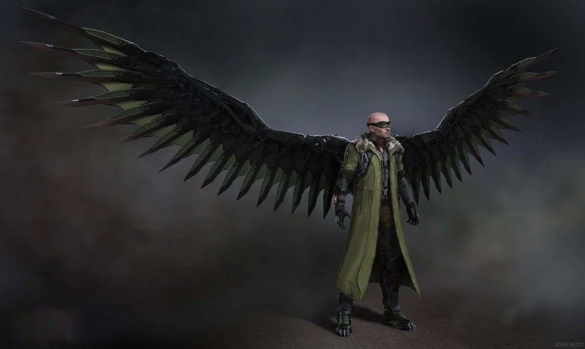
14 Spider-Man 4’s Vulture
Although Sony rebooted the Spider-Man series with The Amazing Spider-Man, some fans will always wonder what Sam Raimi’s fourth Spider-Man film would have been like.
It is now known that Raimi had intended for the Vulture to be the main villain of Spider-Man’s fourth adventure.
Based on the concept art, the costume would have remained mostly faithful to the comic book version, including Adrian Toomes being bald.
Michael Keaton, of course, played the character in Spider-Man: Homecoming but fans of Raimi will always dream of what could have been in Spider-Man 4.
13 Horrifying Lizard
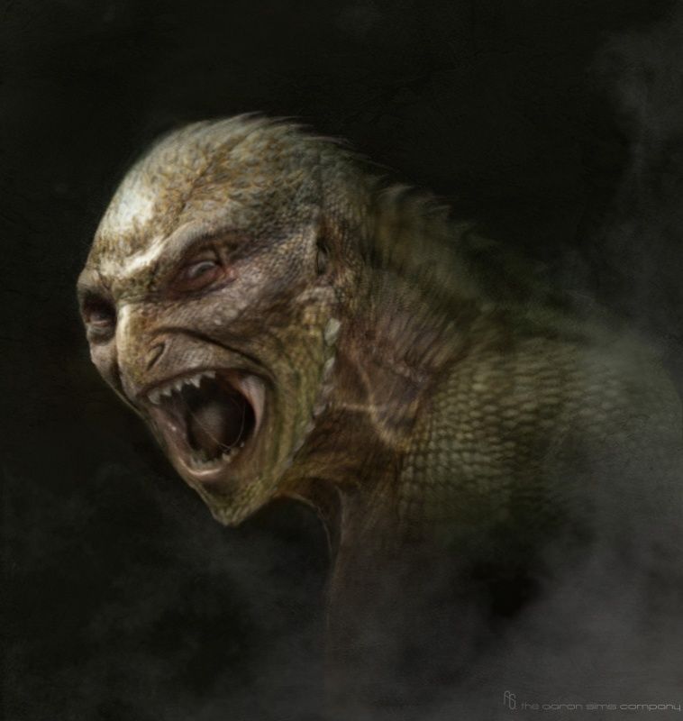
Even though Spider-Man has multiple villains, the Lizard was ultimately chosen for The Amazing Spider-Man.
This film centered around Spider-Man’s conflict with Dr. Curt Connors who mutates into a giant lizard after an attempt to grow his arm back and find a cure for Norman Osborn’s disease.
While this concept art is similar to the final version, this design is much more frightening.
Many people were not a fan of the Lizard’s final design in the film and this could have been a better option if it was developed more.
12 A More Defined Rhino
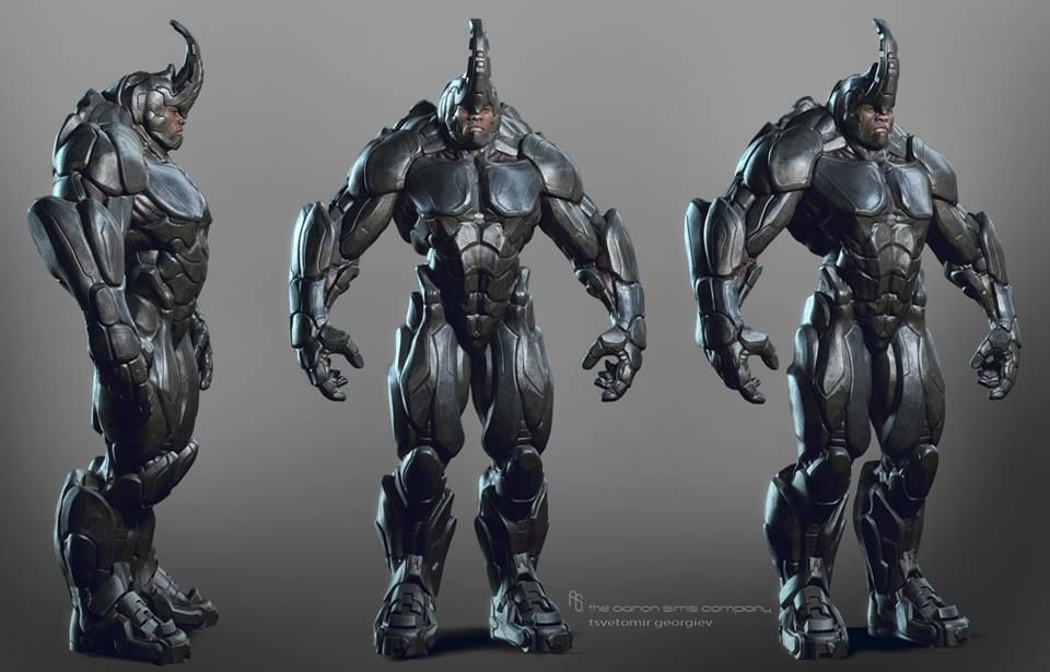
The Rhino was one of the many supervillains that were crammed into The Amazing Spider-Man 2.
Since the Rhino is typically just a guy in a giant rhino costume, it can be hard to adapt the character without making him look goofy.
Paul Giamatti’s version of the character was kind of a waste and the design really wasn’t that great either.
This concept art on the other hand, shows a version of the Rhino that could have potentially saved one aspect of The Amazing Spider-Man 2.
While this design could have saved the look of the Rhino, the writers probably still would have kept his story the same.
11 Comic-Accurate Vulture
Michael Keaton has proven to be able to play an effective superhero as well as a supervillain.
The design for the Vulture was unique in Spider-Man: Homecoming for a few reasons but mainly because of the story behind it.
In the movie, Adrian Toomes built the set of wings with alien technology collected after the battle in New York.
While the story behind the design connected with the ongoing story of the MCU, some would have liked to see a more comic-accurate version of the Vulture which is represented in this concept art.
10 Spider-Man Leaving Mary Jane
This particular concept art may have been developed for the ending scene of Spider-Man 2; however, Spider-Man’s suit appears to be different than what it is in the finished product.
The scene in question is near the end of the film when Mary Jane Watson abandons John Jameson at the altar.
She runs down the streets of New York to go find her true love Peter Parker but soon after he has to leave his apartment as Spider-Man.
The scene is an adequate ending to Spidey’s second outing but it could have been better.
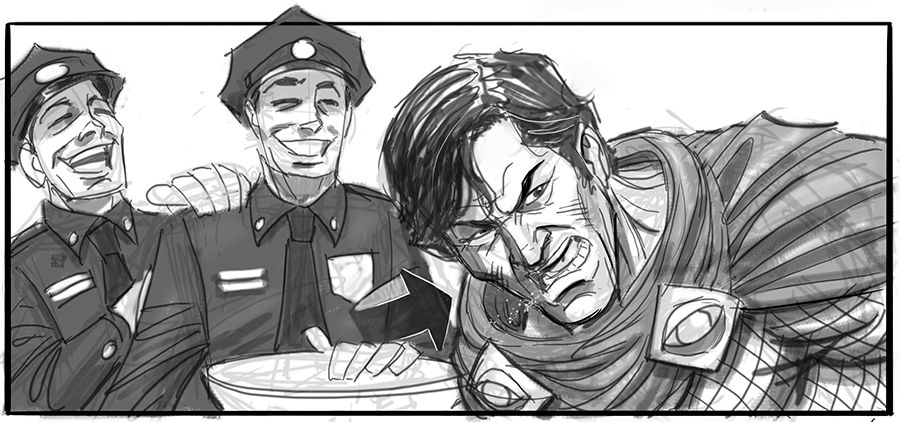
9 Guards Stuck Inside A Gem Vault
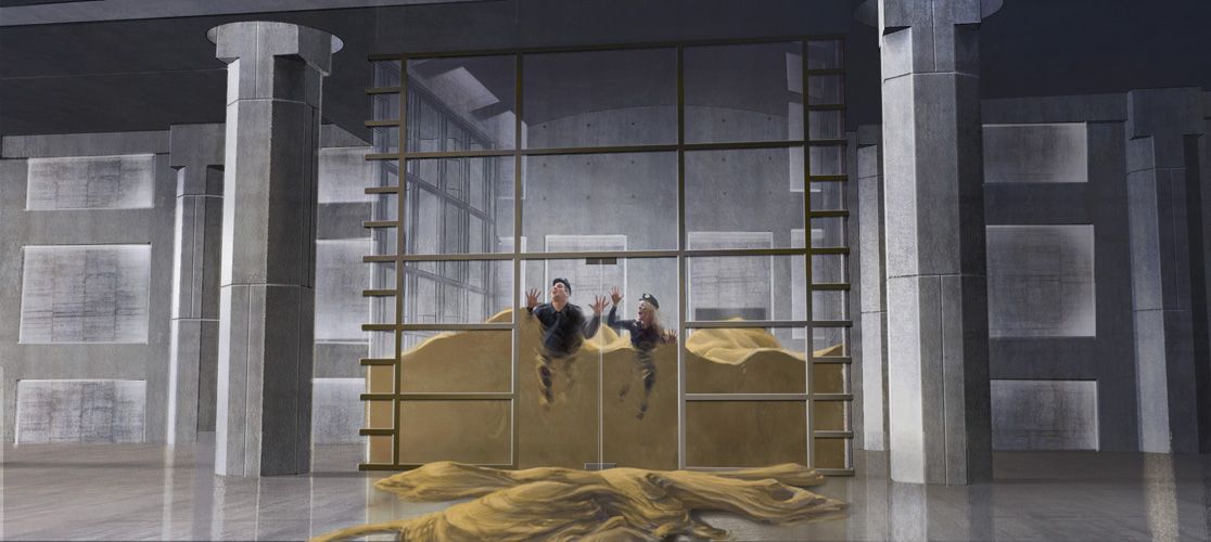
Spider-Man 3 may have not done great with critics, but the special effects were still excellent at the time.
When adapting a character like Sandman, the special effects have to be on par otherwise viewers are just going to get a boring guy in a striped shirt.
There were many scenes where Sandman was able to show off his powers but one scene that didn’t make it into the final cut is depicted in this concept art.
The art by James Carson showcases two guards who have become trapped inside a gem vault after Flint Marko filled it up with sand.
8 Spider-Man Battles The Lizard
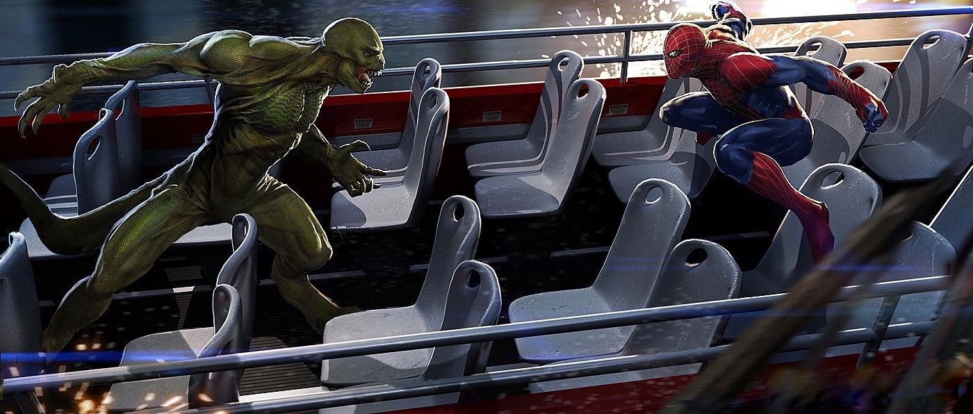
There were many epic fight sequences between Spider-Man and the Lizard in The Amazing Spider-Man.
One scene that didn’t make it into the finished product however, was one where Spider-Man battles the Lizard on top of a moving double-decker bus.
At this point in the movie's development, the character’s designs seem to be already ironed out, but this scene was never depicted in the film.
That being said, seeing Spider-Man battle a giant lizard atop a moving bus could have been a marvelous scene.
7 A Highly Developed Spider Suit
The suit that appeared in The Amazing Spider-Man was different than any other previous suit but didn’t change so much that fans turned against the design.
When The Amazing Spider-Man 2 rolled around Spider-Man’s suit changed again but this time looked a lot more like the costume fans had come to know.
The elongated spider symbol was still present but the rest of the suit resembled Maguire’s suit from the previous films.
Concept art for the film however shows a different version of the suit that would have continued to step away from the classic Spidey design giving Spider-Man a fresh look.
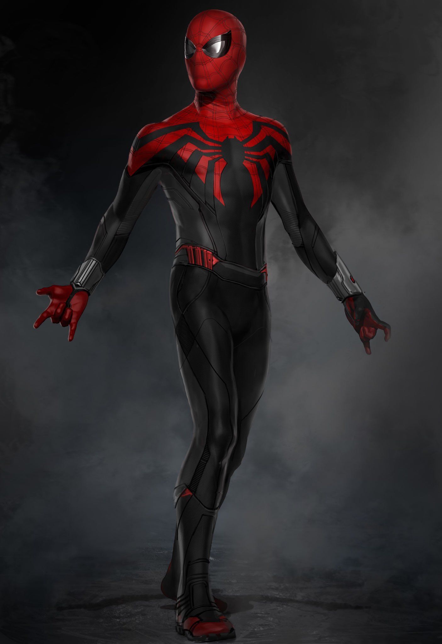
6 The Original Iron Spider Suit
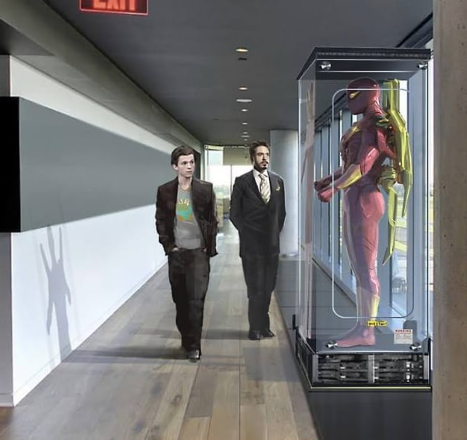
Fans were thrilled when the Iron Spider suit was revealed at the end of Spider-Man: Homecoming.
The design was unlike anything fans had seen before and many speculated that Peter Parker would get to wear the suit when he fought alongside the Avengers in Avengers: Infinity War.
They were, of course, right but the suit almost looked completely different.
As seen in this concept art for Spider-Man: Homecoming, Parker almost got to wear a comic-accurate Iron Spider suit.
This version completely ditched the blue and instead went with the all red and yellow design.
5 Sam Raimi’s Black Cat
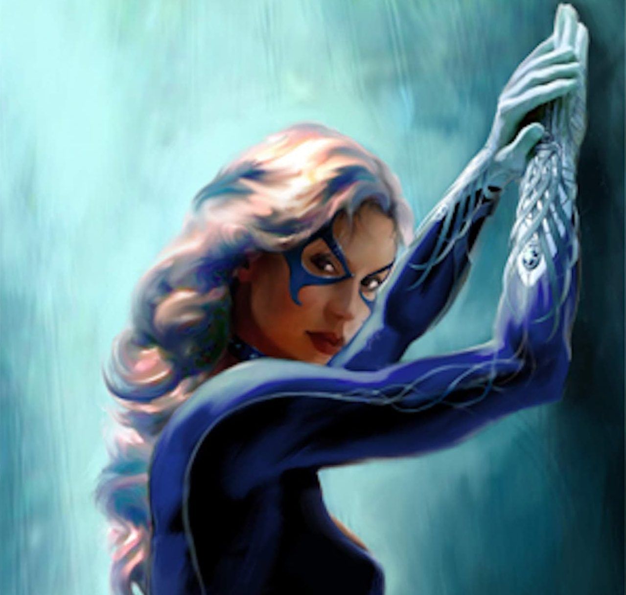
Felicity Jones may have gotten to play Felicia Hardy in The Amazing Spider-Man 2 but she never got to develop into Black Cat since future Amazing Spider-Man movies were canceled.
That being said, not many people know that Black Cat was almost a villain in Sam Raimi’s Spider-Man 2.
This concept art depicts what the designers had in mind for the character before she was ultimately taken out of the script.
Like many other Spider-Man villains, fans will never get to know what Raimi’s vision of the character would have been.
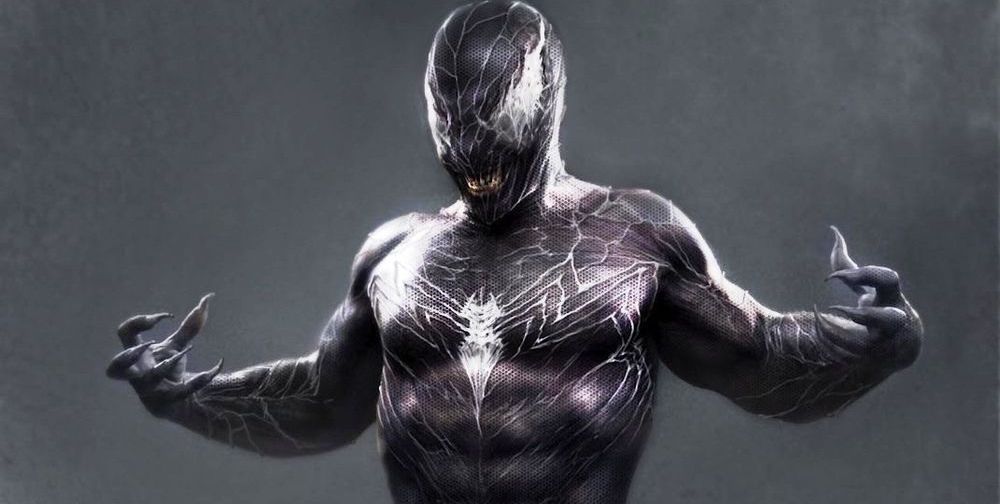
4 Gary Ross’ Venom
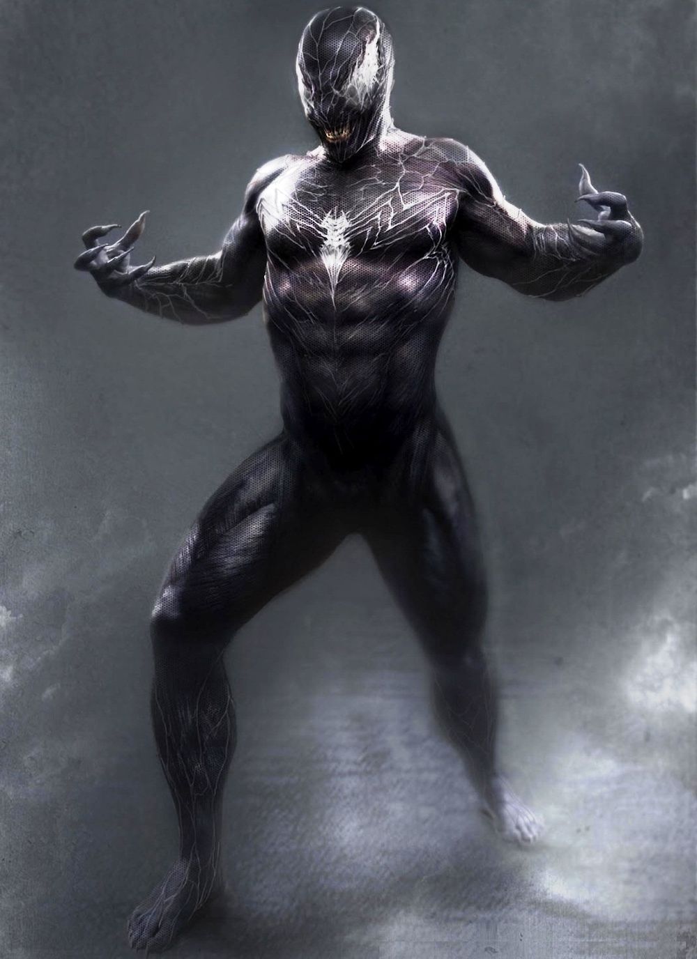
Sony may now be coming out with a Venom solo film starring Tom Hardy; however, a Venom film starring Topher Grace almost happened.
The film was going to be released after Spider-Man 4 but was eventually canceled after Sony passed on Raimi’s fourth Spider-Man movie.
The movie would have included Grace’s Venom and Jim Carrey was rumored to be playing Carnage.
While Raimi’s version of Venom was not well received, Gary Ross had been hired to direct the film which could have potentially saved the alien character.
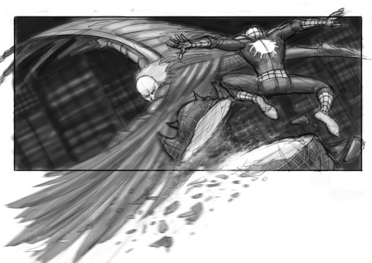
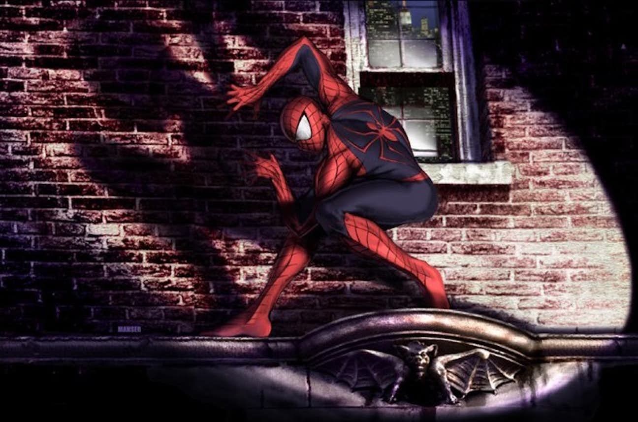
3 Spider-Man Throwing A Gargoyle
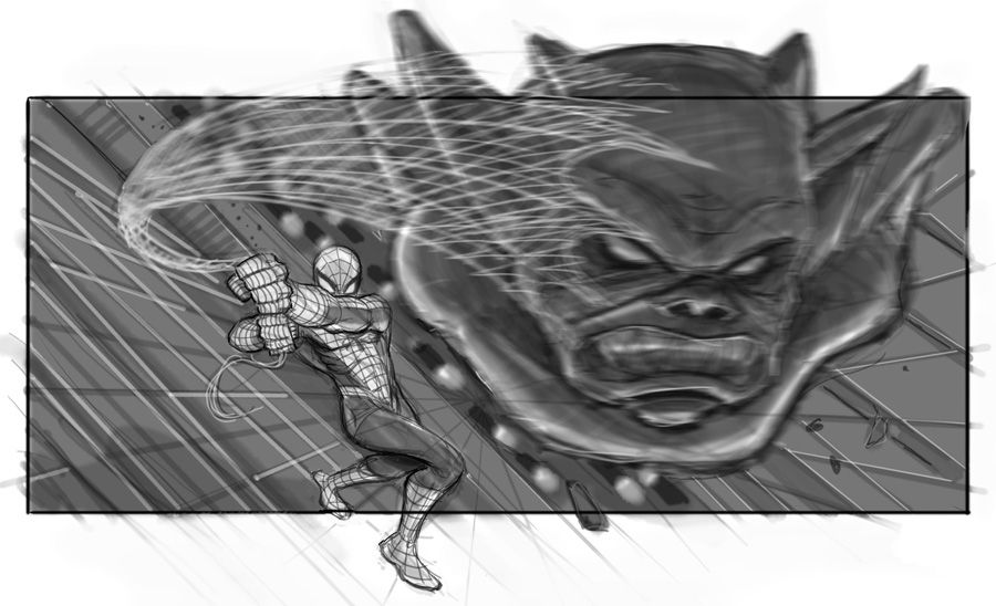
Spider-Man 4 may have never happened but thankfully concept art from the film exists.
Raimi had intended to have a montage of supervillains, that weren’t popular enough to be the main character, being captured by Spider-Man at the beginning of the movie.
This concept sketch shows Spider-Man standing on the side of a building and using his webbing to throw a loose gargoyle at an unknown target.
With 3D really becoming popular around the time Spider-Man 4 would have been released, this would have been a great scene to see up on the big screen.
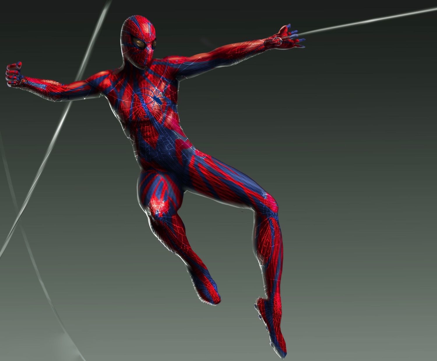
2 Spider-Man 2’s Alternate Suit
The suit that developed from Spider-Man to Spider-Man 2 really didn’t change in appearance all that much.
The only big difference was that the color scheme was significantly brighter for the sequel. That being said, this concept art shows a costume that would have been a big change from the previous version.
There are two noticeable differences - one being that Spider-Man has big white eyes as compared to the previous smaller and silver eyes.
The spider symbol on his back is also much larger in this version than in the final form of the suit.
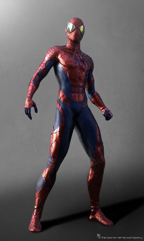
1 The Classic Spider-Man Suit
Marc Webb’s The Amazing Spider-Man no doubt had a unique looking costume for Spider-Man.
Concept art for the film however, shows a much more classic looking version of the character.
This version of the costume has hard edges for the blue and red parts of the suit, a smaller spider logo, as well as eyes that go out to the side rather than pointing up.
The artwork might not be exactly like the original costume; however, it looks much closer than the suit that made it into the finished product.
---
Are there any other Spider-Man concept designs that are better than the finished product? Let us know in the comments!
from ScreenRant - Feed https://ift.tt/2PAzCLj


0 Comments