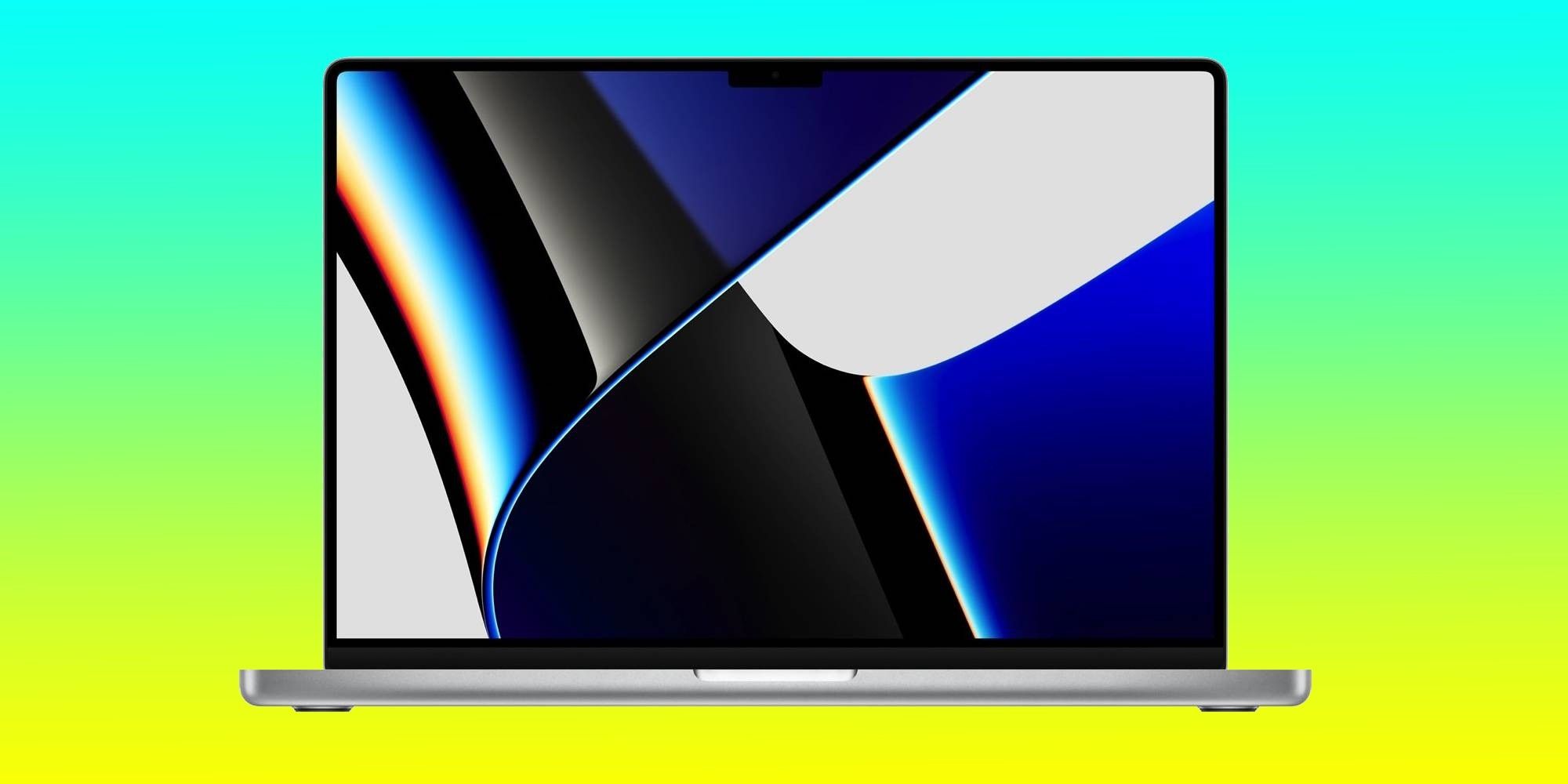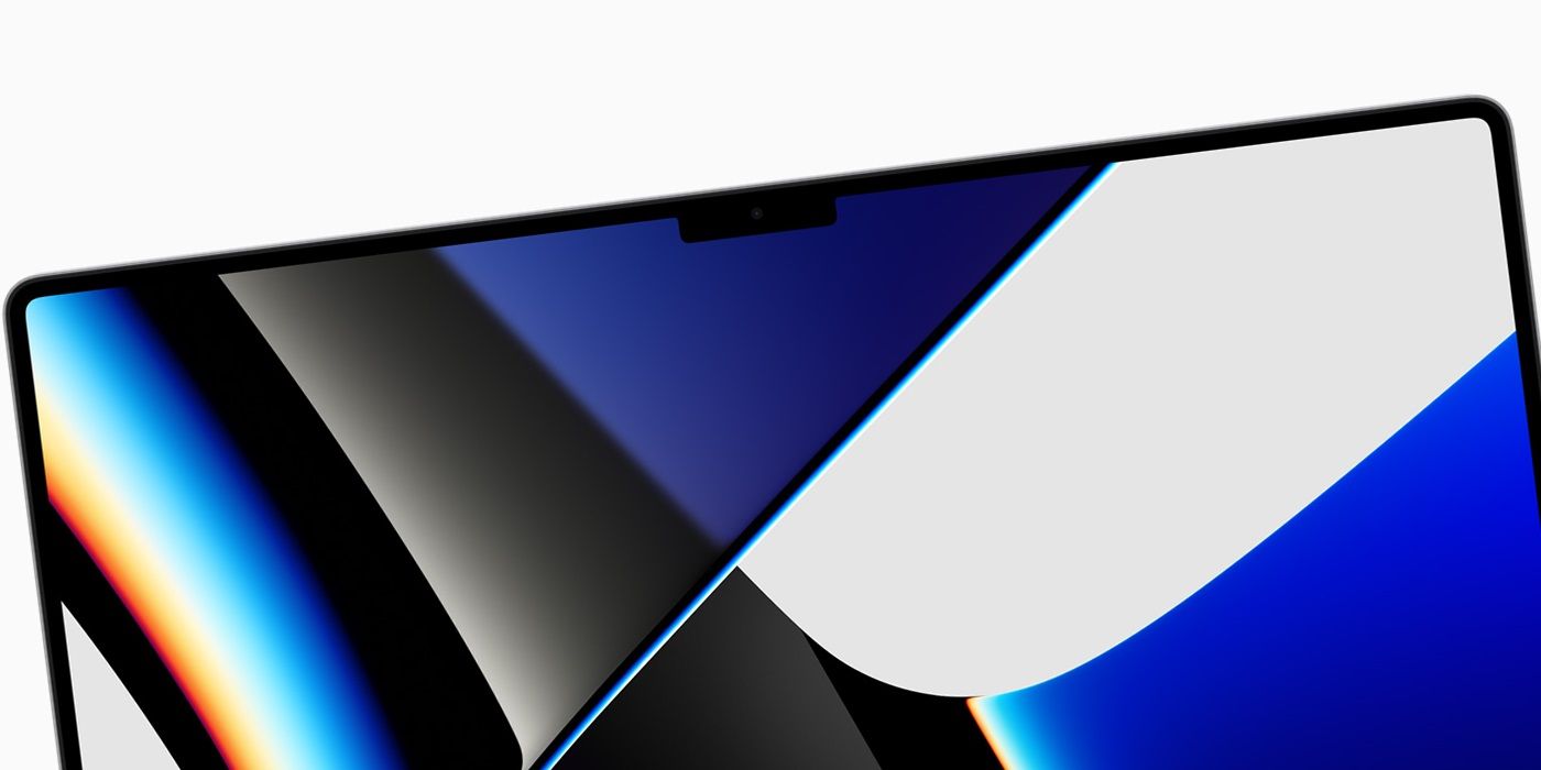
Apple's new MacBook Pro models have a notch issue, so the company has released a ‘fix’ which renders the entire horizontal space around the notch useless by pushing all content down and leaving a thick black bar at the top. The notch doesn’t look good by any stretch of the imagination, and the only consolation is that users will eventually get used to it. Apple initially reasoned that it had to go with a notch because of the new camera hardware that bumps the resolution from 720p to a much needed 1080p.
The company later explained that packing a notch allowed Apple to make better use of screen space due to the bezels at the top now being slimmer. The left side of the notch is where the menu bar items sit, while the right side is reserved for status icons. In simple words, the notch solved two problems in one go. Except, the implementation itself was problematic as the menu bar items got pushed behind the notch while using certain apps, leaving users to blindly navigate the cursor to access those ‘hidden’ tools.
Well, Apple has acted quicker than expected to quell some of the bad press with a new tool called "Scale to fit below built-in camera" that solves the notch problem, but also brings back the larger bezels from the previous-generation MacBook Pro models. As detailed in a freshly released support document, it allows users to change the active area that an app can use for showing content. Once enabled, the Menu bar and app windows are pushed below the notch area, which is now surrounded on both sides by a sea of black pixels. All that talk about making efficient use of screen real estate suddenly vanishes, and users are left gazing at black bezels. The situation is actually funny as third-party developers have already developed solutions to kill the notch area — well before Apple could release ‘an official fix to a problem.'

For apps that don’t play well with the notch area, users first have to quit the application, click the Finder icon in the dock, and then select the Applications option in the Finder sidebar. Once there, users have to pick the app that is giving them notch nightmares. After selecting the app, users need to hit the Files option, followed by Info. Alternatively, a Command + I shortcut will also work. In the Info window that pops up, users will see a “Scale to fit below the built-in camera” to activate the black bars around the notch and push content below the notch level. However, it appears to be a temporary fix in macOS Monterey because users have to do it on a per-app basis depending on how the notch problem manifests.
Apple notes that once developers optimize their apps to work with the notch area, the “Scale to fit below the built-in camera” option will disappear. Just like the notch on the new 14-inch and 16-inch MacBook Pro models, there are also workarounds for iPhones that flaunt a notch. Apple has managed to shrink the notch considerably from the iPhone X days and the notch on its new iPhone 13 series is considerably smaller without making any compromises. It’s just odd to see that Apple couldn’t do the same for the notch on its MacBook Pro, which doesn’t even pack Face ID hardware.
Source: Apple
from ScreenRant - Feed https://ift.tt/3jLt525

0 Comments